01.
Dataportal -
Airbnb
02.
Apple Music for Artists -
Apple
03.
Cybersecurity Posture -
Balbix
04.
Mass Transit iOS App -
SEPTA
05.
Survey for Property Owners -
Hilton
06.
Credit & Debit Card Servicing -
Wells Fargo
07.
Energy Consumers iOS App -
Duke Energy
08.
Digital Products for Retirement -
Wells Fargo
Project & Role
Dataportal,
Lead Product Designer
Lead Product Designer
Client
Airbnb
Date
2021-2023
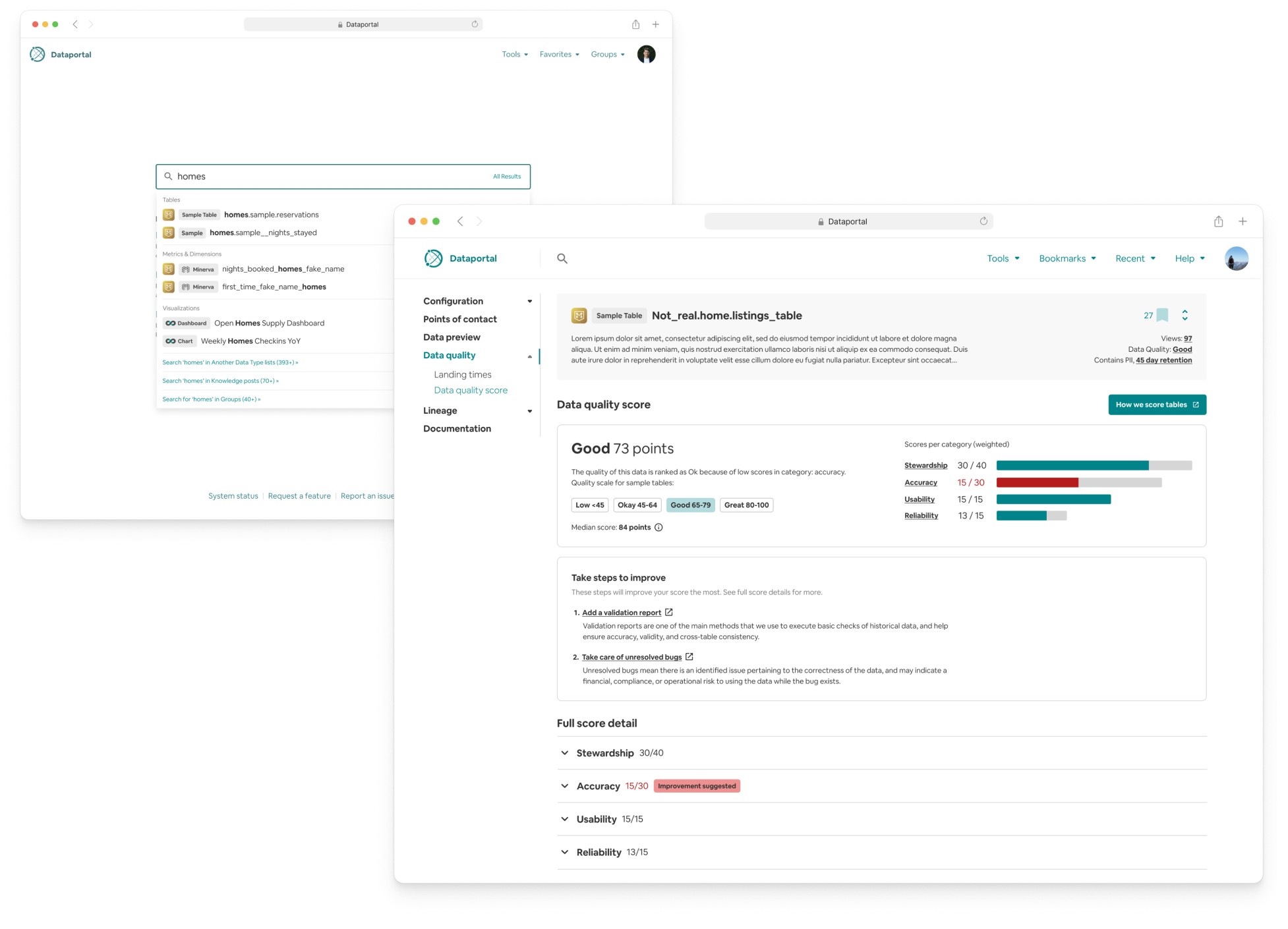
GOAL
Redesign of an internal data tool that services the companies entire data ecosystem. Outlined and executed user research to define what the site needed to better succeed at servicing data consumers, updated architecture and features.RESULT
Increased discovery of content types by 3x of previous design, 75% increase in search bar typeahead usage, and 50% more unique page views per month.Over two year of contracting, I lead the redesign of dataportal, updating, replacing, and redesigning standards from old design libraries, bringing them up to date with all workplace tools at Airbnb.
MY ROLE
Lead Product Designer - Freelance ContractDue this work being under NDA, I am limited in showing it online. I would be excited to show more of what I accomplished at Airbnb during an interview.
Project & Role
Analytics Platforms,
Sr. Product Designer
Sr. Product Designer
Client
Apple
Date
2019
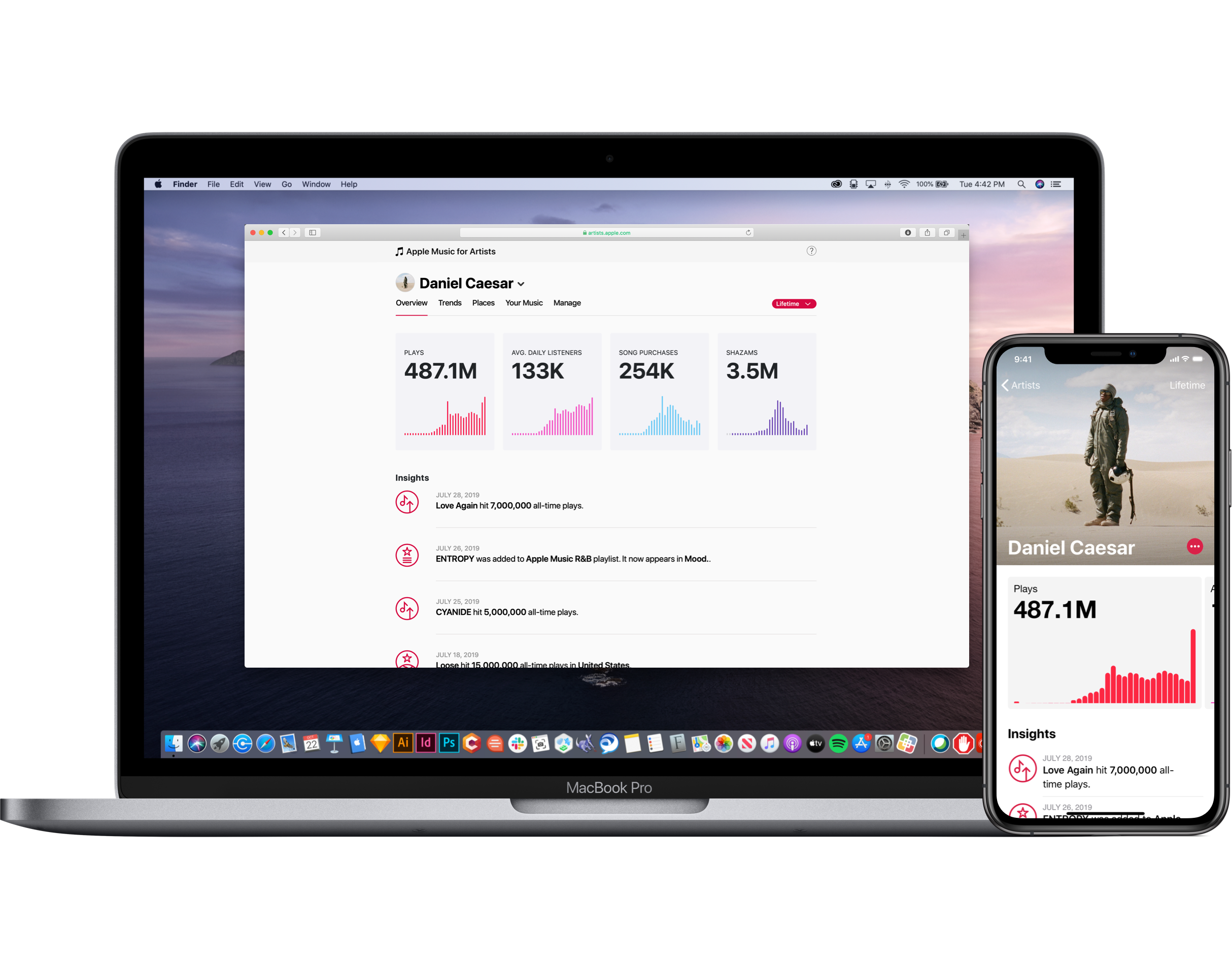
GOAL
Establish new design patterns, interactions, and visuals, for analytics product within the Apple Media Product (AMP) ecosystem, improving dated experiences across web and iOS applications.RESULT
Redesigning an analytics tool with updated design patterns, inclusive of new data. Fully responsive web experience. Helped to better curate the data discovery experience for artists and data consumers.MY ROLE
Sr. Product Designer—Apple Music for Artists. Additionally, I helped define design system components for the larger suite of analytics products. Due to this work being under NDA, I have limited capabilities in showing it online. I would be excited to talk more about my role with Apple at an interview.
Project & Role
iOS Application (POC),
Lead Product Designer
Lead Product Designer
Client
Duke Energy
Date
Q1 2017
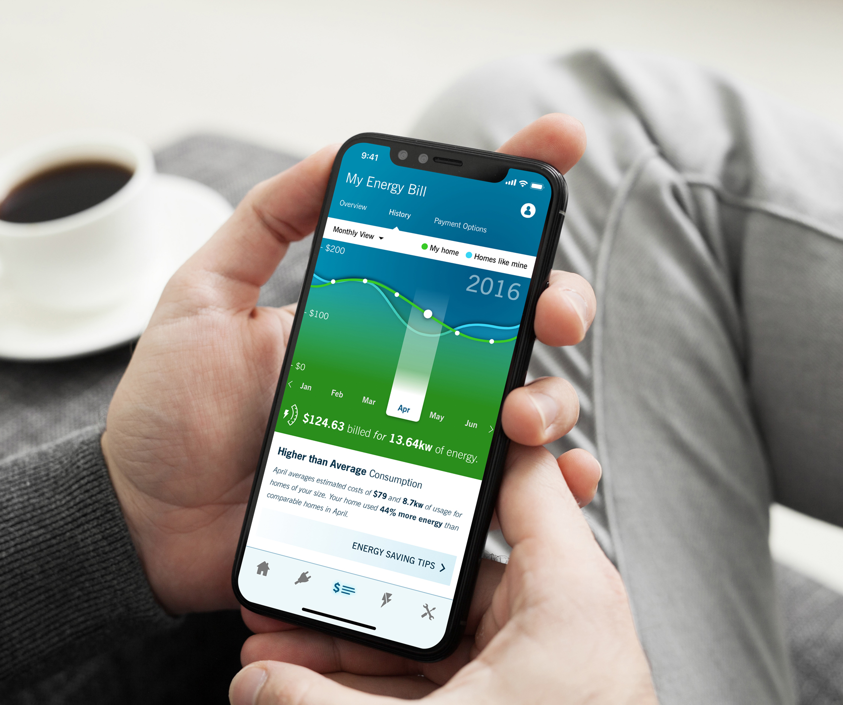
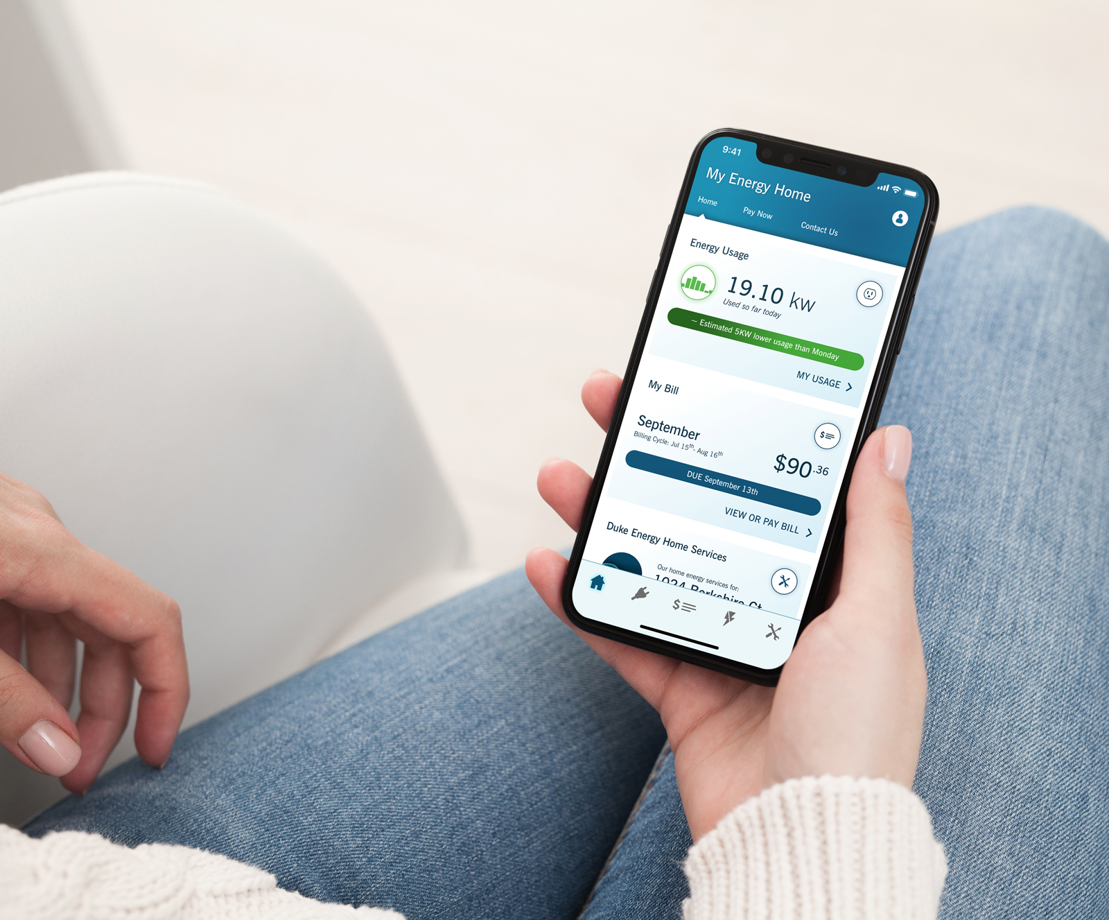
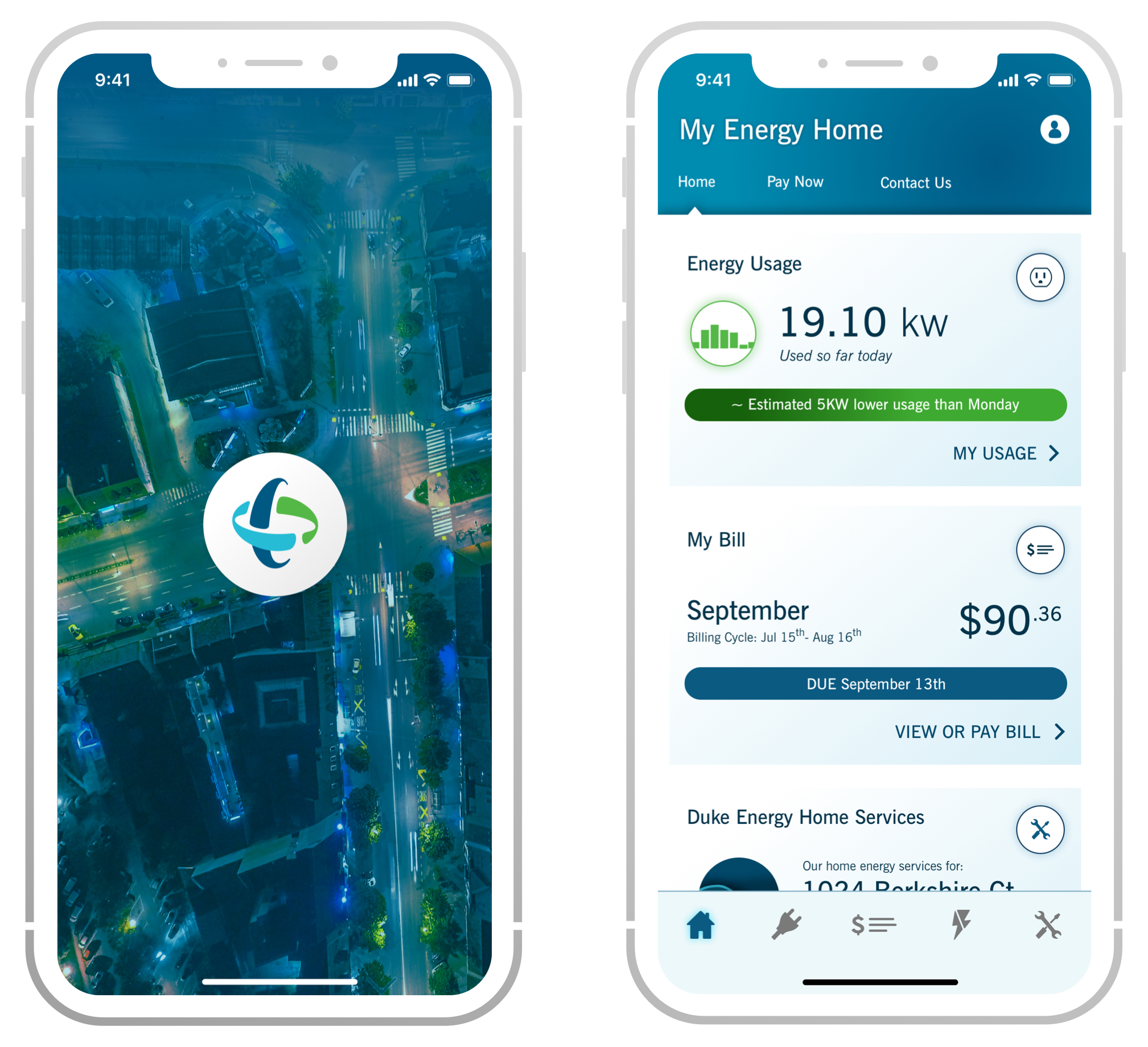
GOAL
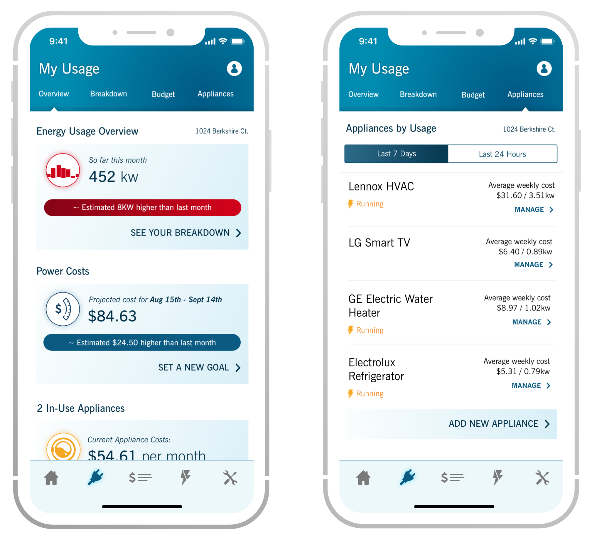
Build a proof of concept application for Duke Energy Innovation Lab, that empowers energy customers to discover their consumption data.RESULT
A digital product design study, that defined possibilities in customer engagement.MY ROLE
Lead Product Designer alongside a UX researcher and Jr. Visual Designer, responsible for collaborating with Duke Energy product & business leadership.
Data Inspiration
WHO
All energy consumers in Duke Energy’s service area (Western Carolinas). Research was focused on larger families, living in large and small spaces, to define their understanding of energy consumption.WHY
Energy customers don’t have access to a mobile platform. Duke Energy needed ideas of how to help customers become more cognizant of their energy situation.
Build a Case
GET STARTED
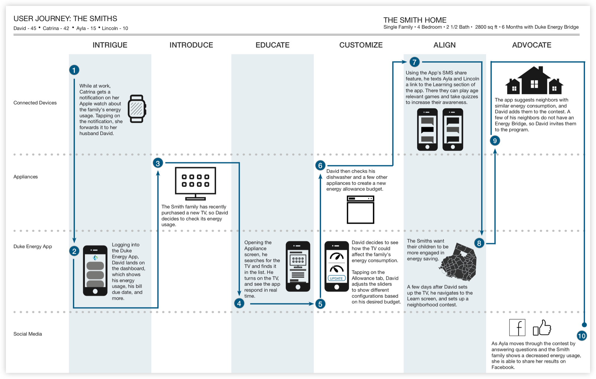
A brand should build value for customers through a mobile product, so that over time they can further align and advocate for the service.TOUCHPOINTS
The evolution of the product will be defined by the small ways in which it enables customers and connects them with data. Details matter. This family story was created as inspiration to lead the mobile POC design.
Discover, Learn,
& MAU's
& MAU's
DISCOVER
Discovering energy data as it relates to time & space was the central pillar of the product thinking. Consumers are more valuable to a brand when they deeply understand the service they pay for, even for simple utilities in regulated markets.LEARN
We wanted to upgrade energy consumers ideas of consumption, providing both kilowatt and monetary information to them in the same space.MAU's
Over time, the abundance of easily collected data matched with the time and space in which consumers live—will promote long term product usage.
Constant Simplification
Here’s a look at design process over time, as the product needs changed—and became more streamlined—so did the UI.
The end goal is always to reach a high quality visual, matched with an even better user experience. Without the fusion of the two, you will never know the product potential.
The end goal is always to reach a high quality visual, matched with an even better user experience. Without the fusion of the two, you will never know the product potential.
Useful & Beautiful
GOAL
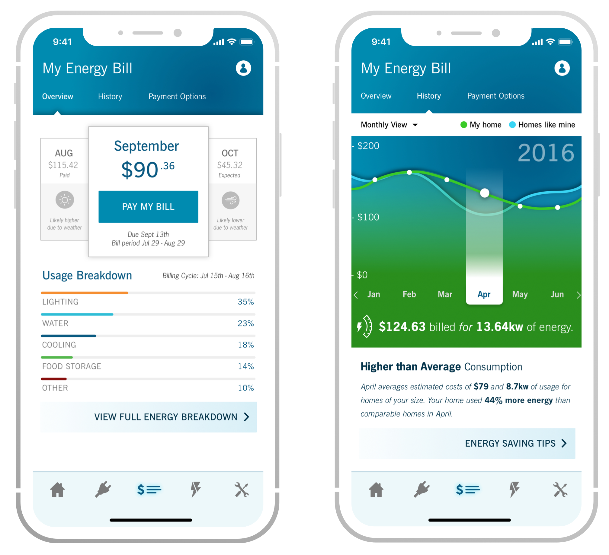
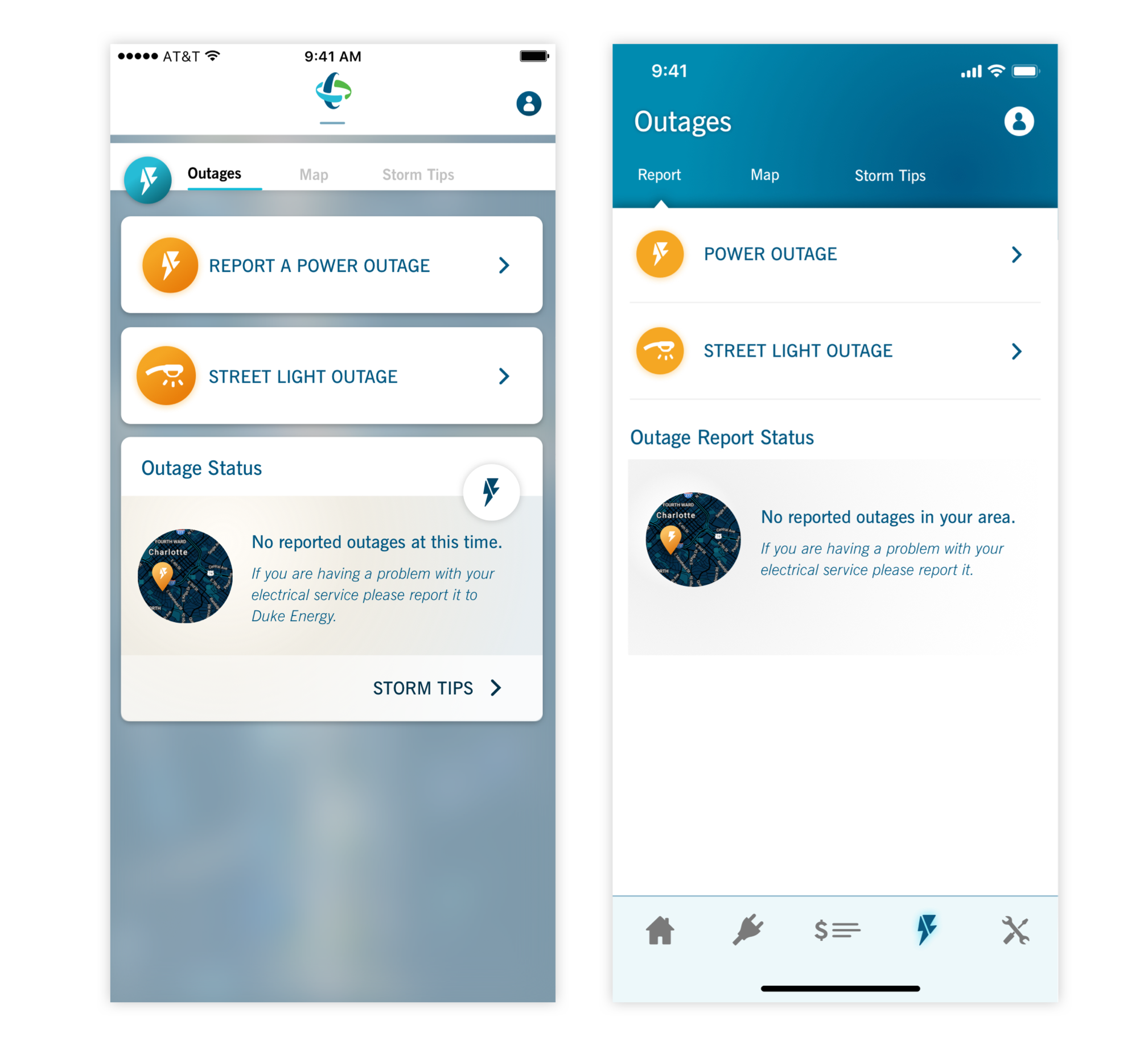
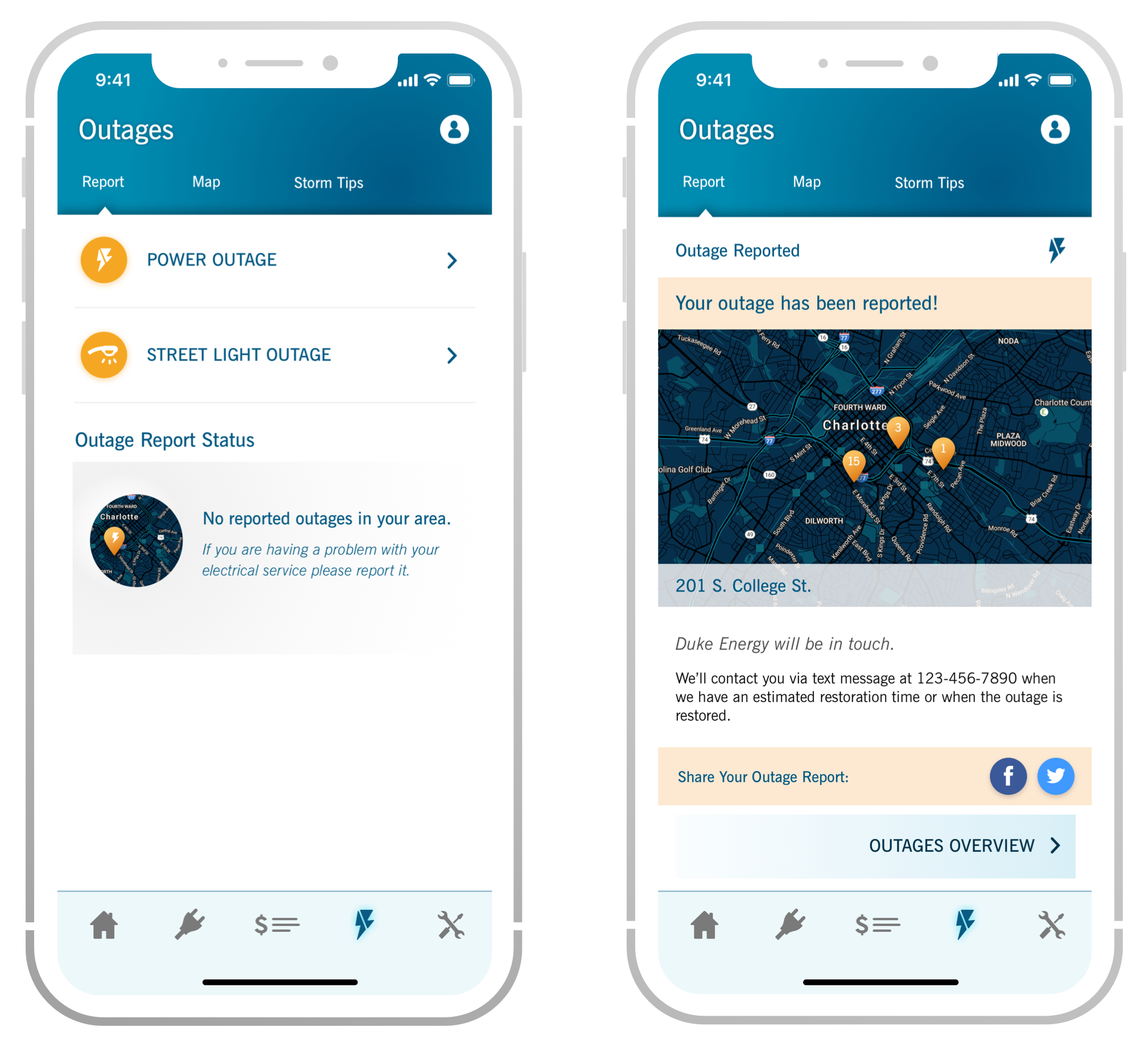
Make people aware of current reports before creating their own. It helps Duke Energy to not field multiple outage reports if they’re already working on the problem.EVOLUTION
Design always becomes clearer over time. This evolution is a good example between our 1.0 and 2.0 products. Simple & cleaner, with better content priority.
Product Goals
WHO
Customers concerned about their consumption, but felt that energy usage was a fact of life they can't control.WHY
Energy consumption isn’t going to change as our demand becomes greater. Taking steps to update your home can have truly tangible monetary benefits for your future. Just the mere awareness of these energy problems is also a success metric.
Expanding the Standard
Brand standards that aren’t crafted for the digital age need to be re-written and mixed up. Every visual standard should be offered in digital context, if not created first for the digital era.
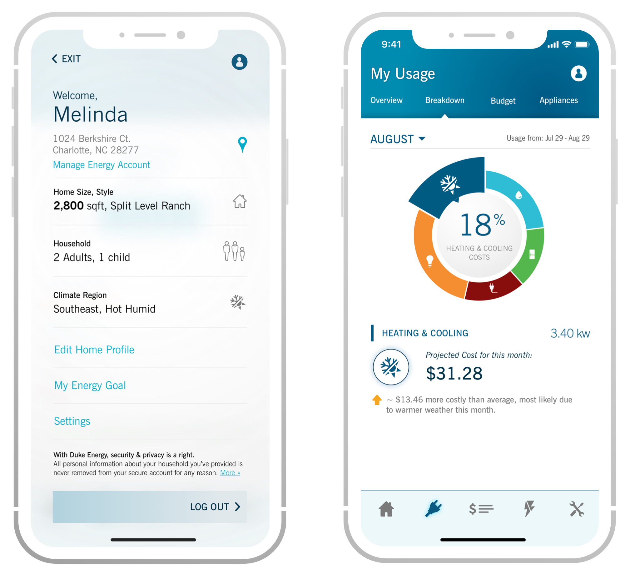
Working with the brand colors, we aligned the interface with visual themes that promoted a sense of fluidity, understanding, and electricity.
Working with the brand colors, we aligned the interface with visual themes that promoted a sense of fluidity, understanding, and electricity.
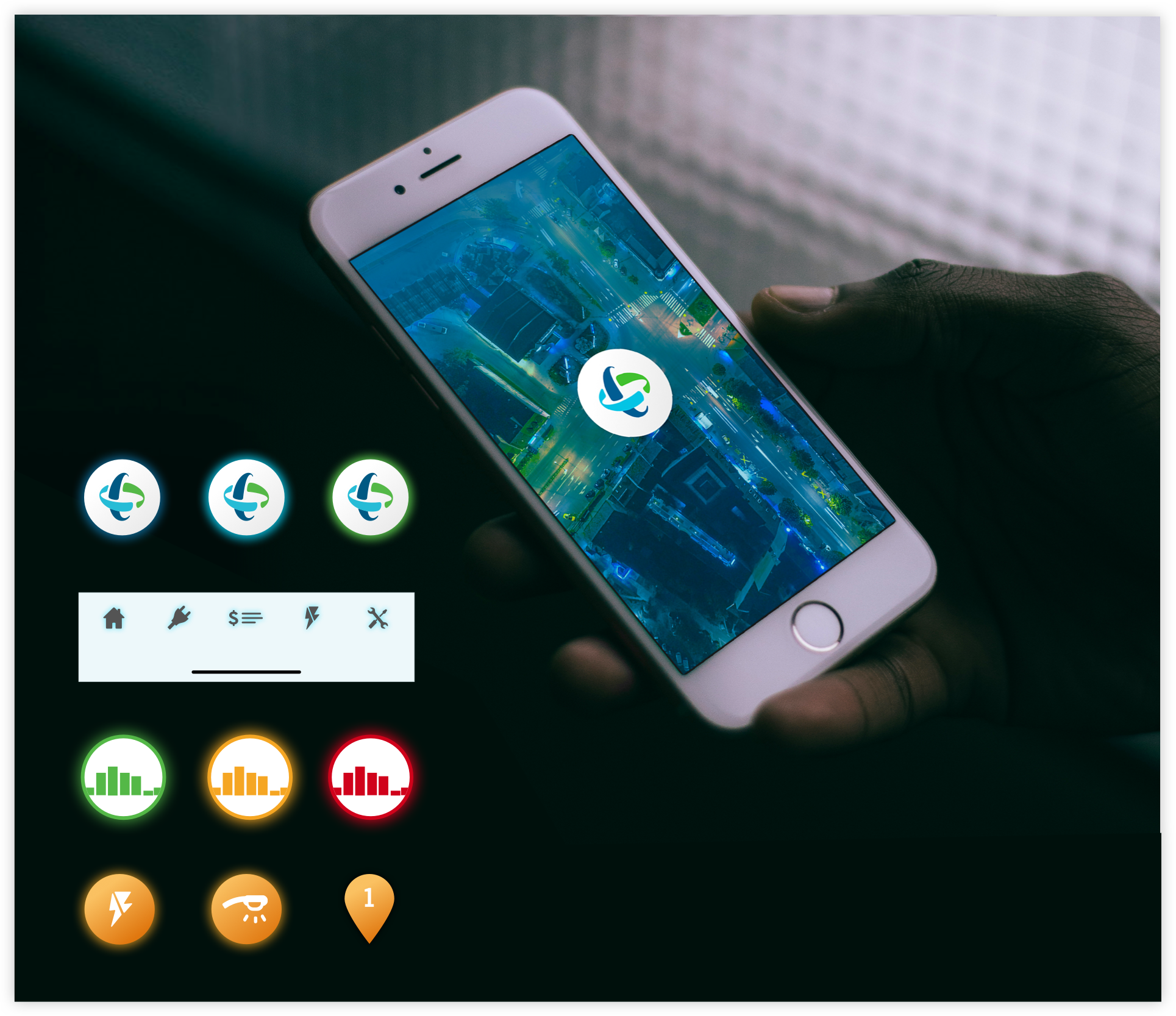
UI Artifacts
This product should offer a fresh visual sense, breaking the rigidity of current and outdated mobile language. This resulted in themes of light vs. dark—threading brand blues throughout.
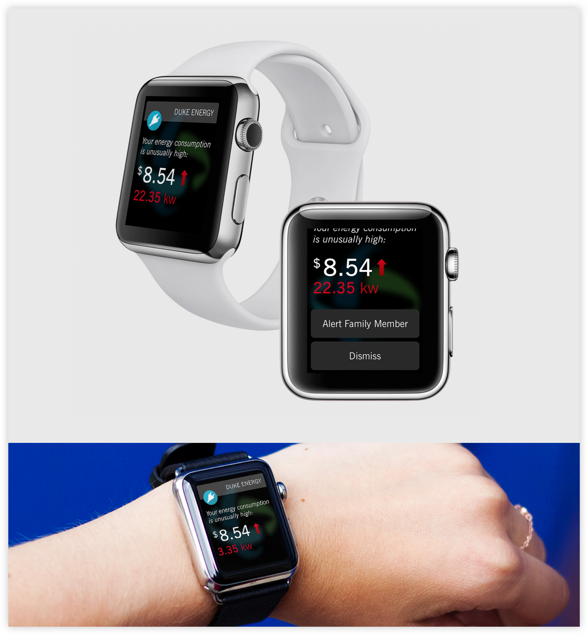
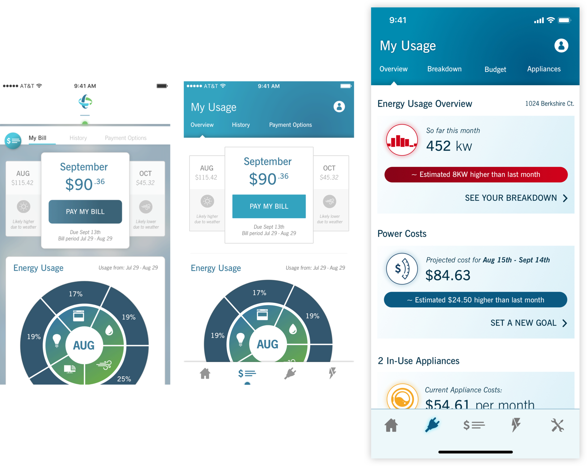
Simply Flexible
Data will not be consumed to its potential if only offered in one place throughout a product lifetime. Simple and intuitive extensions of your product create updated scenarios of everyday use.
Use Your Data
THE PROBLEM
Companies lacking in product thinking are largely just ignoring data, or the potential for data collection. Often the larger the entity, the more unused data available.WE ASKED
Duke Energy needed to better consider how to serve data in relation to user’s needs—and not just build a product that mimicked mobile web features.
Industry Leaders
Duke Energy is referenced as a brand that leads in energy innovations and distribution technology. Product design should match in sophistication, to inform consumers and instill trust.
Project & Role
Digital Products
for Retirement,
Lead Visual Designer
for Retirement,
Lead Visual Designer
Client
Wells Fargo
Date
2015 & 2016
GOAL
Build a site for companies large-sum asset management and better tools for individual retirement accounts – spanning a multi-year contract.RESULT
A desktop web product for portfolio managers, and improvements to the web and mobile experience for individual employee contributors mainly, retirement education tools.MY ROLE
Lead Visual Designer for all digital products, worked alongside UX researchers and Jr. designers, Wells Fargo product owners and project managers.
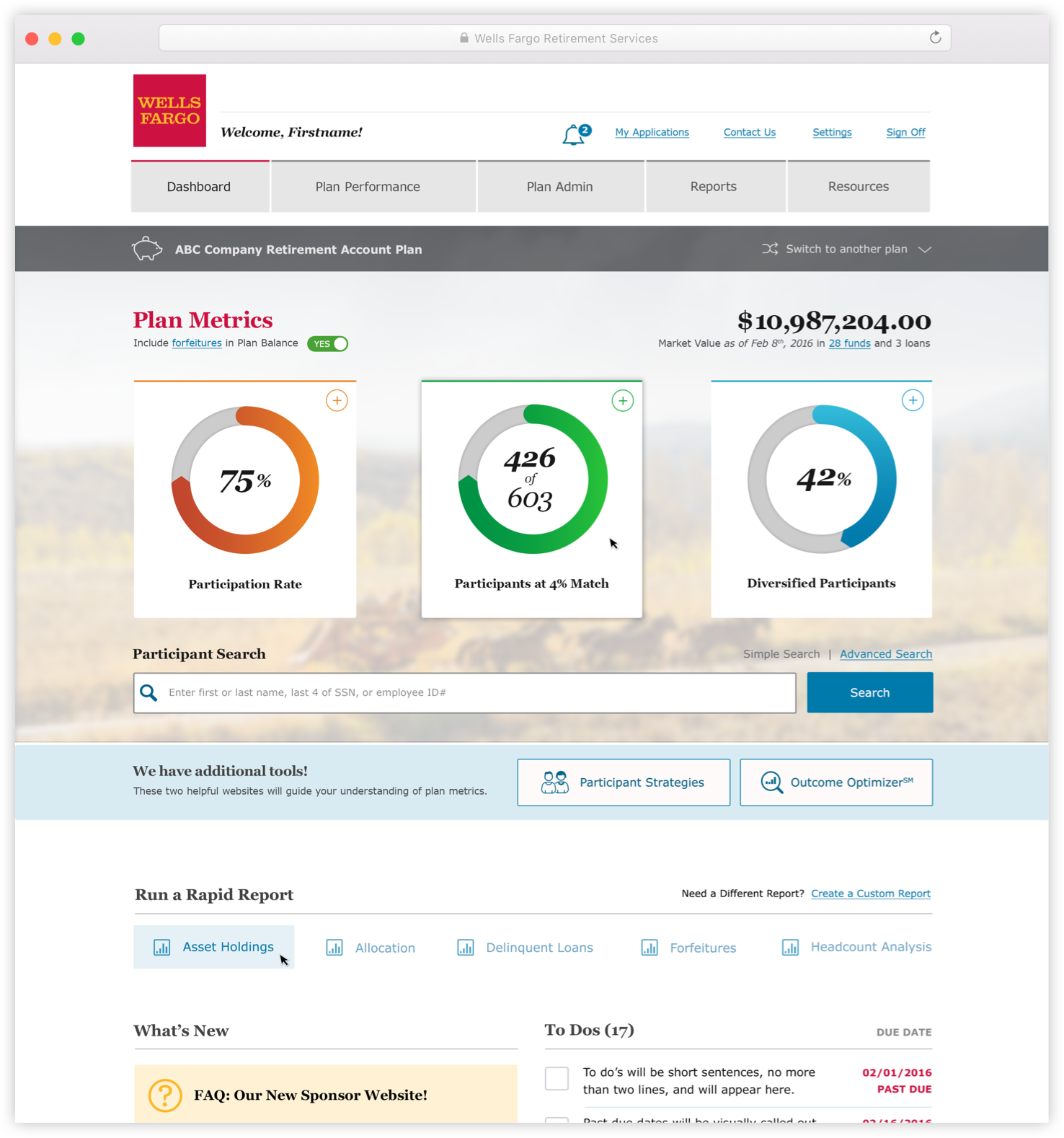
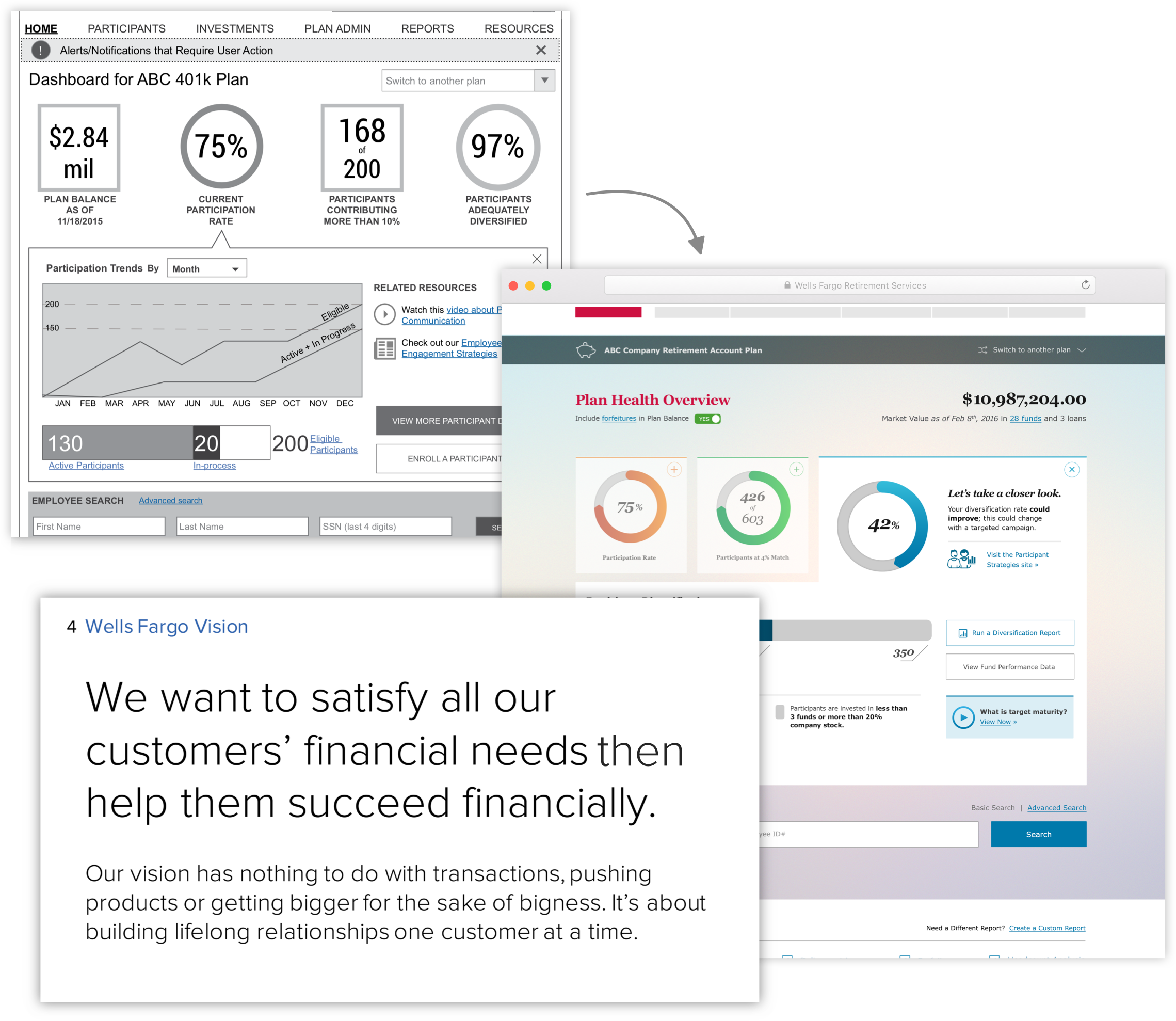
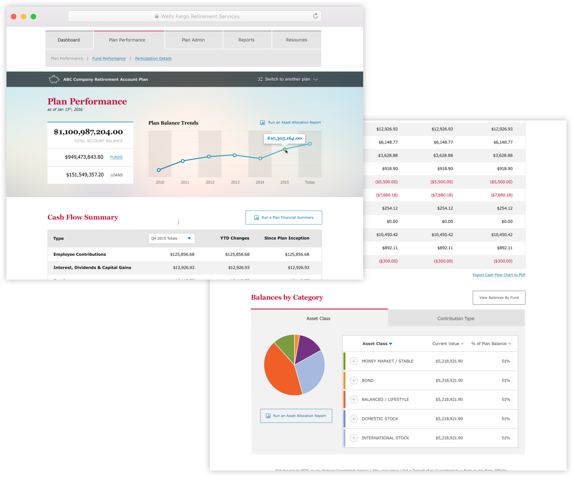
Retirement Asset Management
WHO
Money and HR managers at companies world-wide.WHY
Managing millions of your employee’s dollars should be a detailed and robust experience, and every team member responsible should have tools to enable them.
Prior to 2016, these tools didn’t exist. Our team created this universal web experience for all account holders.
A Vision for
Everyday Use
Everyday Use
ETHOS
Create a functional space for money data, to promote added value each time one interacts. Don’t ship features just because it’s a goal. Realize the only way to improve trust and brand equity is to provide value through a detailed understanding of who and why.
PROCESS
Money doesn’t need to be dry and lifeless, and employee management certainly shouldn’t.
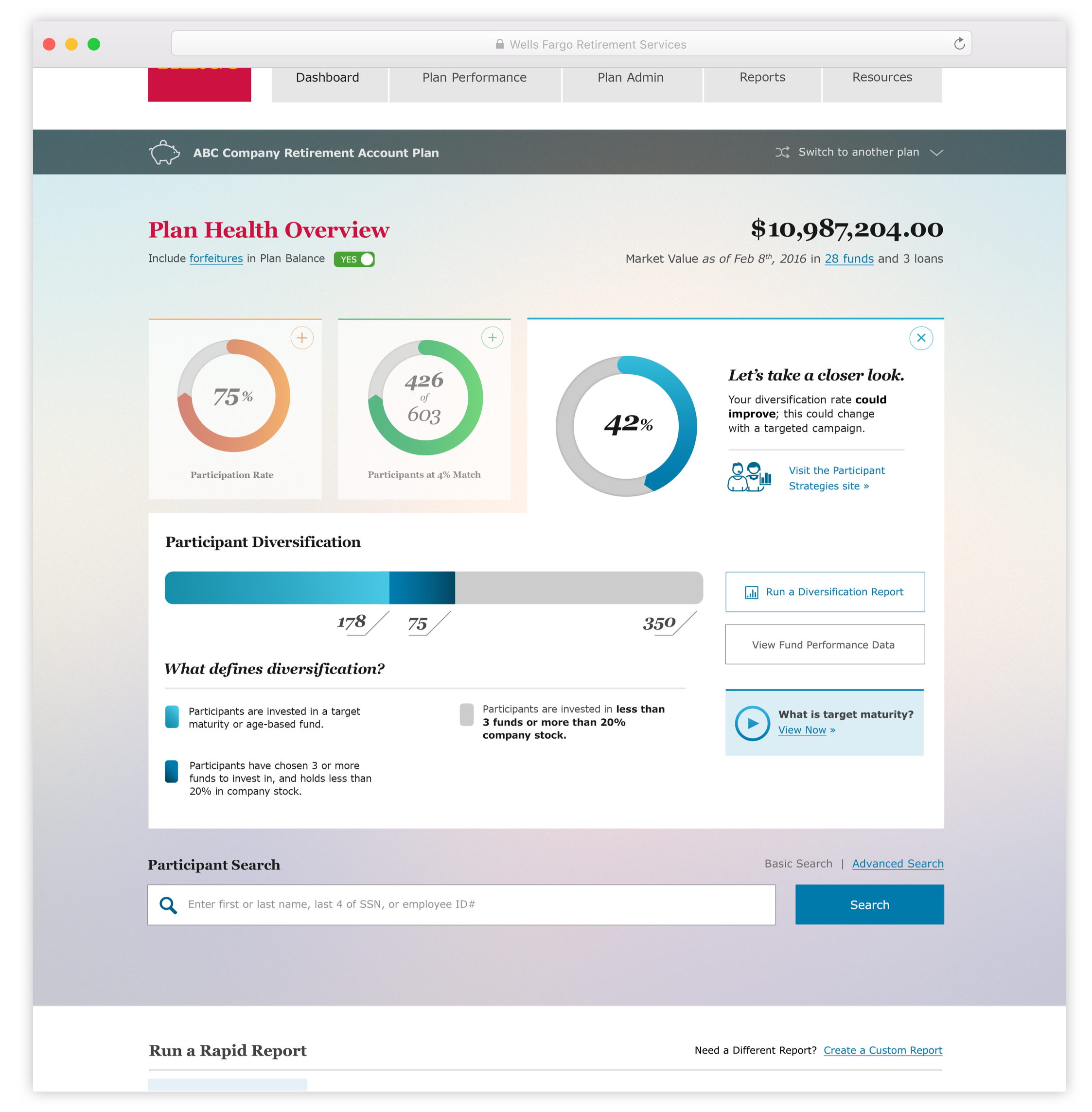
Financial Health
DISCOVER
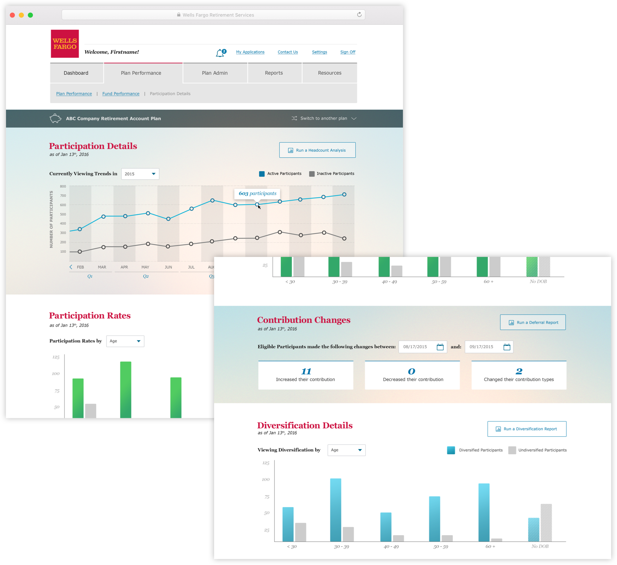
Providing statistical data for managers to understand the bigger picture defined the product ethos. We acknowledged that plan managers have a better understanding of their goals than the bank, so this page compares three metrics for individual conclusions.
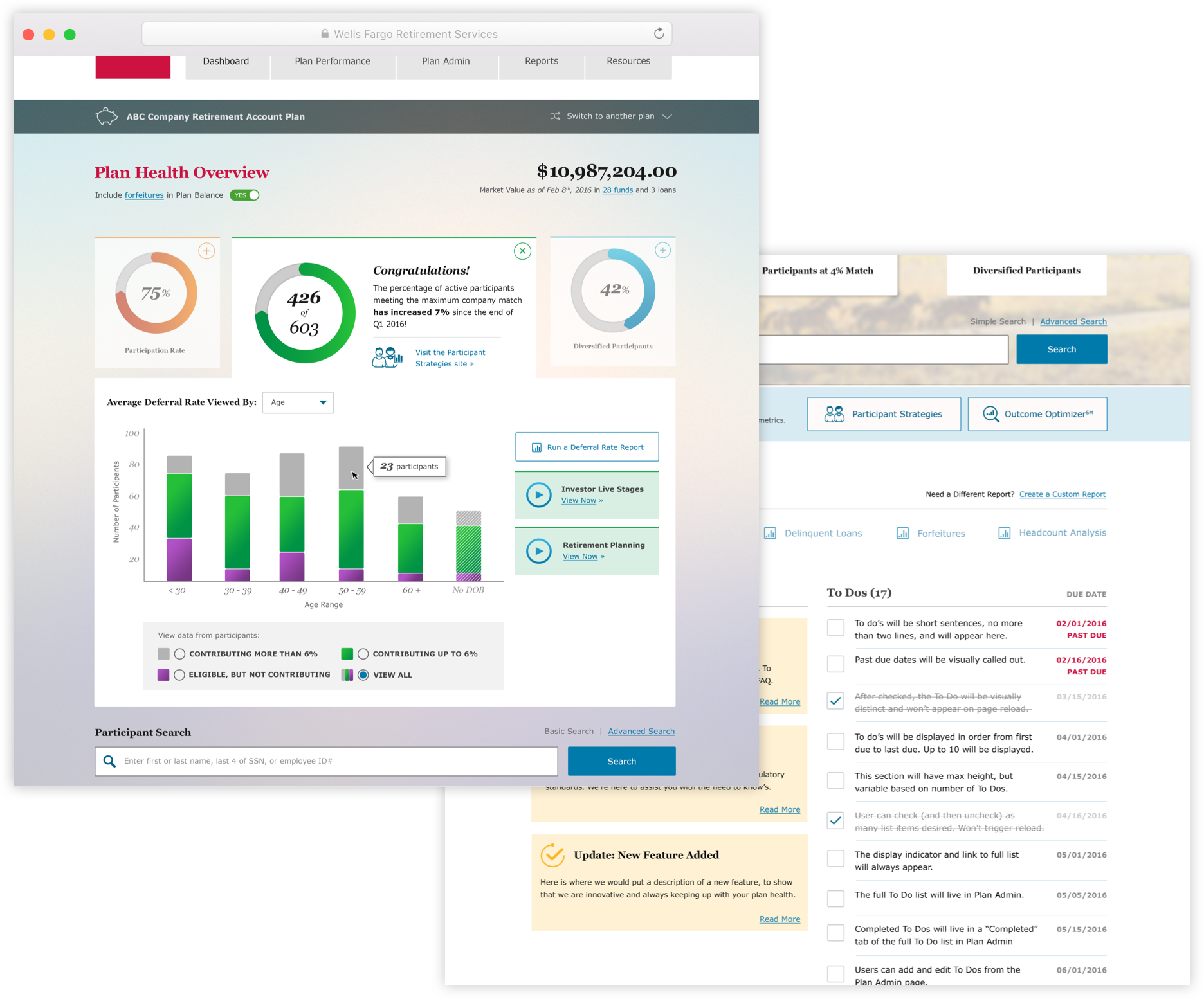
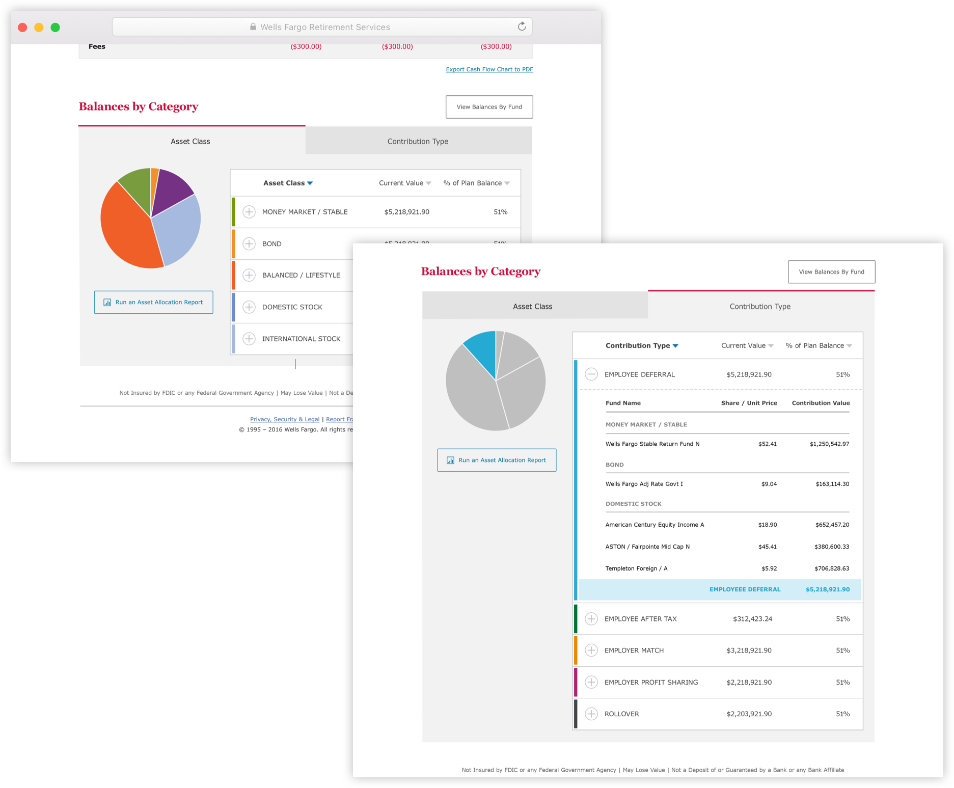
Repeated Experience
Data design should satisfy the audience—not just convince them of a certain data point. This product created many visual and interaction design firsts for the undefined spaces of the banks digital product ecosystem.
While staying true to their brand, we minimized harsh colors, and introduced areas of graphic intensity and graphic brevity to balance function of the form.
While staying true to their brand, we minimized harsh colors, and introduced areas of graphic intensity and graphic brevity to balance function of the form.
Serve Your User
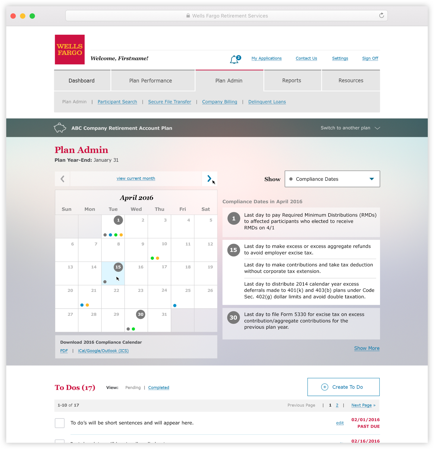
WHO
Money managers who are responsible for regulatory and compliance deadlines need robust functionality and consistent form.WHY
People now expect products to help them along the way. The standard has changed, and we told users that we recognize this expectation through an administration calendar.
Framing the Data
Managers need to consistently match up employee data with earnings over time. The participation details screen helped them understand their company story, and current situation. You should always leverage data and extend the offering to help people.
Adding Value
WE LEARNED
These simple ideas that had yet to make it to this financial platform were some of the most celebrated additions by plan managers.No mistake, these pages were a lift for the development team, but the inspiration is always clear in hindsight. People want to consume information and formulate needs after building knowledge. Remove the guesswork and introduce potential.
Financial Graphs
Page design continued from above
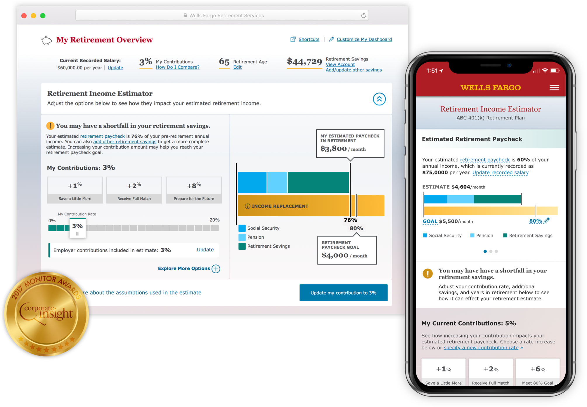
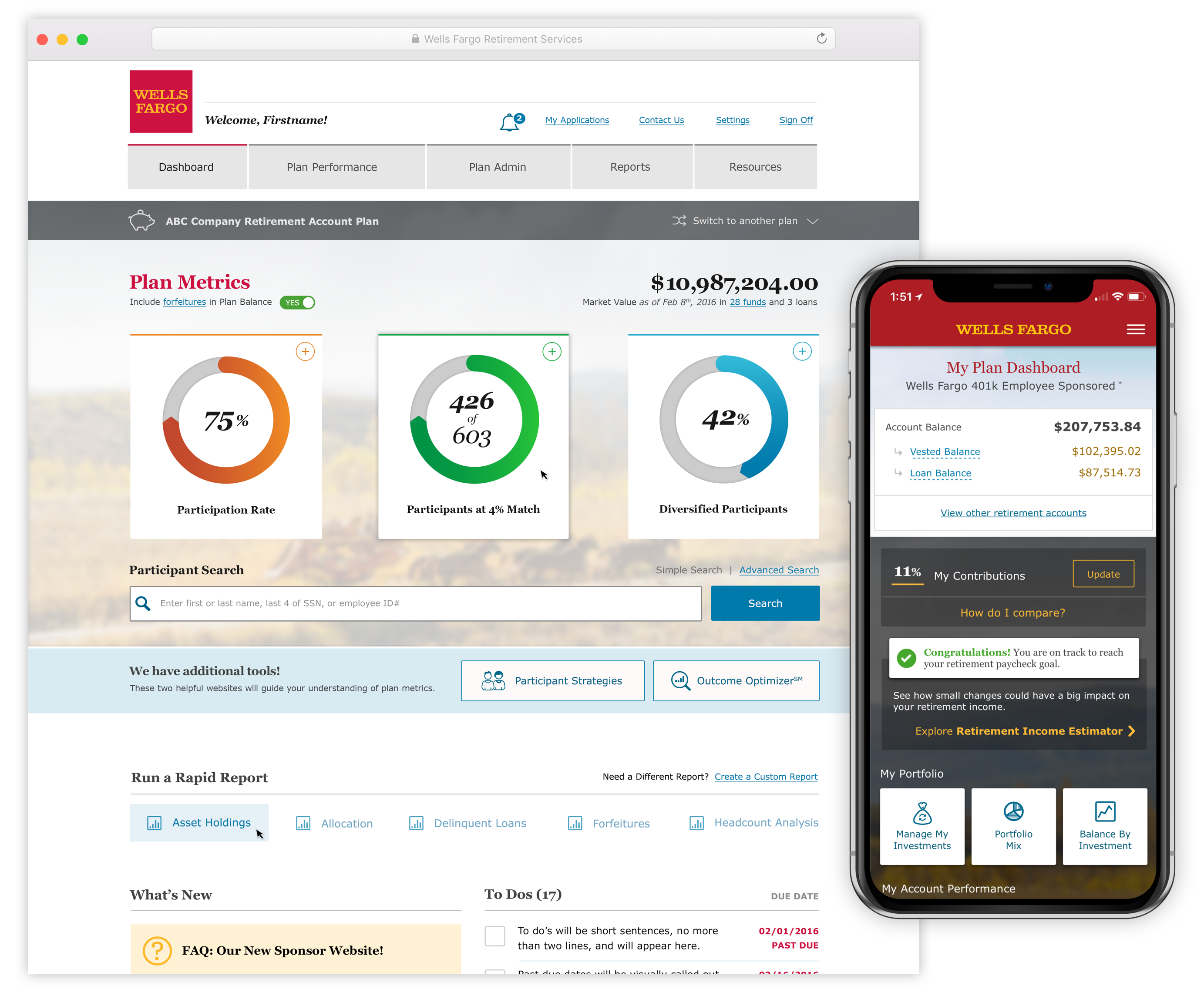
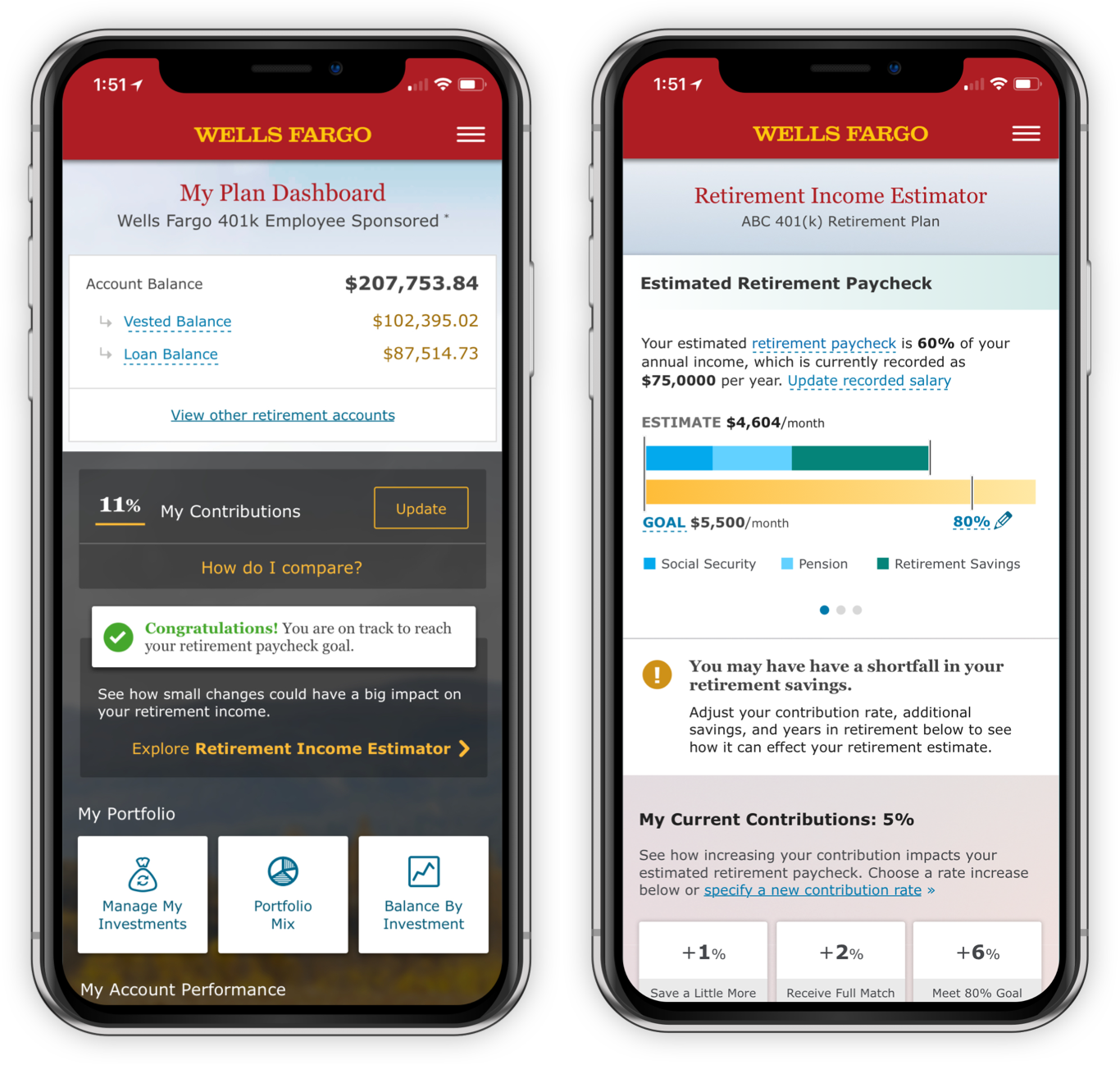
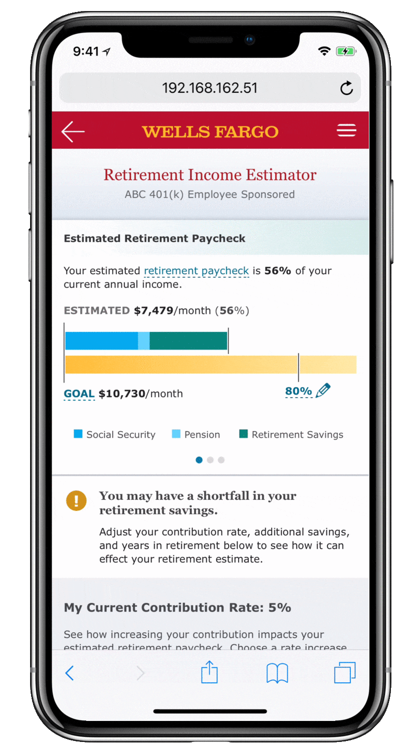
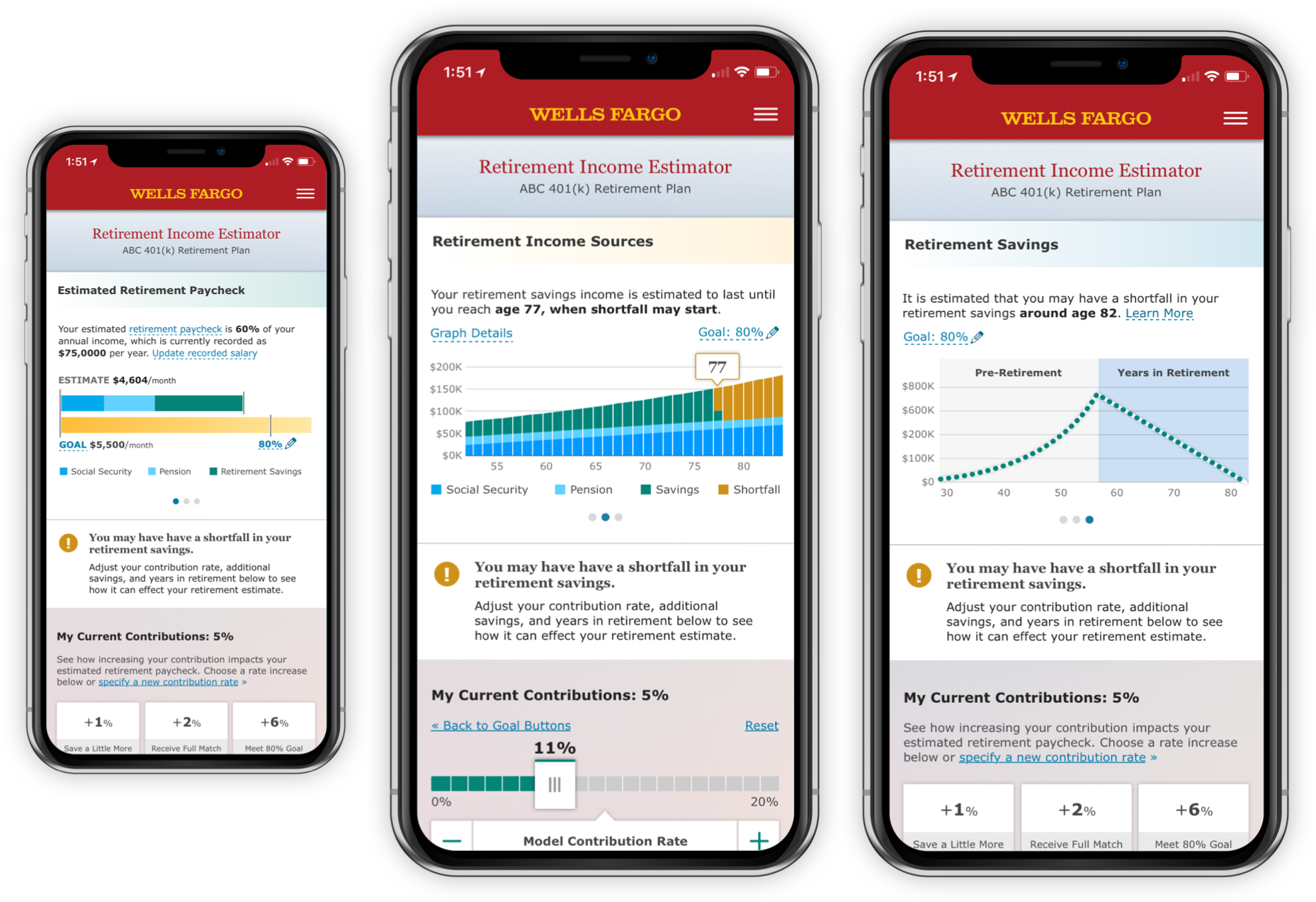
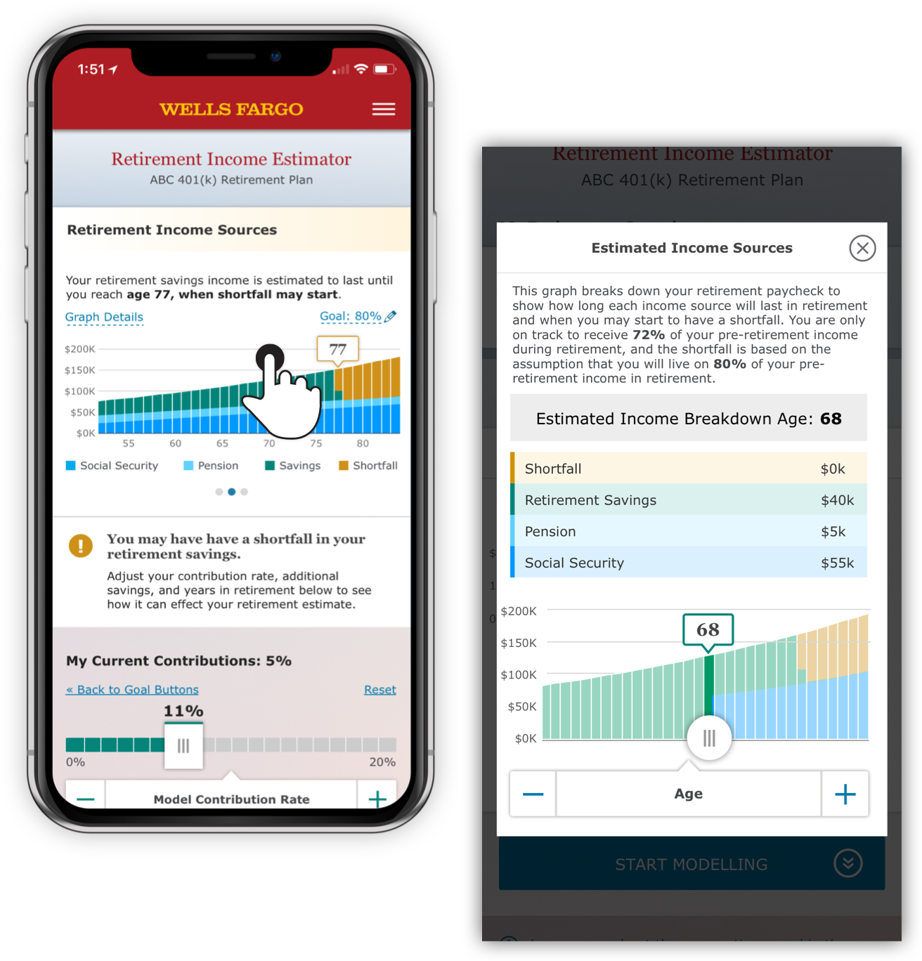
Retirement Income Estimator
GOAL
Create a retirement paycheck calculator, that gives a single contributor more knowledge about their retirement account. The tools main focus forecasts how much your current saving habits will earn you in retirement.RESULT
The Retirement Income Estimator, a single page tool versatile enough to provide a full picture of how retirement saving works and asks users to consider an increase in their pre-tax contributions. This page was awarded a Gold Medal by Corporate Insights for a robust retirement experience.MY ROLE
Lead Visual Designer, alongside lead UX design.
Audience
WHO
All users who contribute to a 401(k) plan with Wells Fargo Advisors.WHY
People are not informed, or ill-informed about retirement. Financial products should offer more than just balance information. The product should break down perceived notions about how money works in retirement—without the need for complex financial advisor relationships.

Encourage Understanding
Provide more context, and make people feel more connected to their decisions. Remove passive action.
WE LEARNED
Most people don’t have a clue how much money they’ll want in retirement. The mobile version of this platform exceeded users’ expectations during testing. They were surprised and delighted with value of this tool, once they took a moment to explore.
Financial Support
ETHOS
Support customers by providing more data than expected. Make them feel like part of the product experience, rather than making the product feel like a barrier. Continue this process over time, as new needs arise and new information becomes available.

Design for Content
PROCESS
Heavy content can alarm users. Interacting with a UI isn’t always a means of requesting more complexity, but often times more detail, with more focus.The legal needs of these pages required them to be text heavy at times, however, keeping important controls on screen was as well a priority.
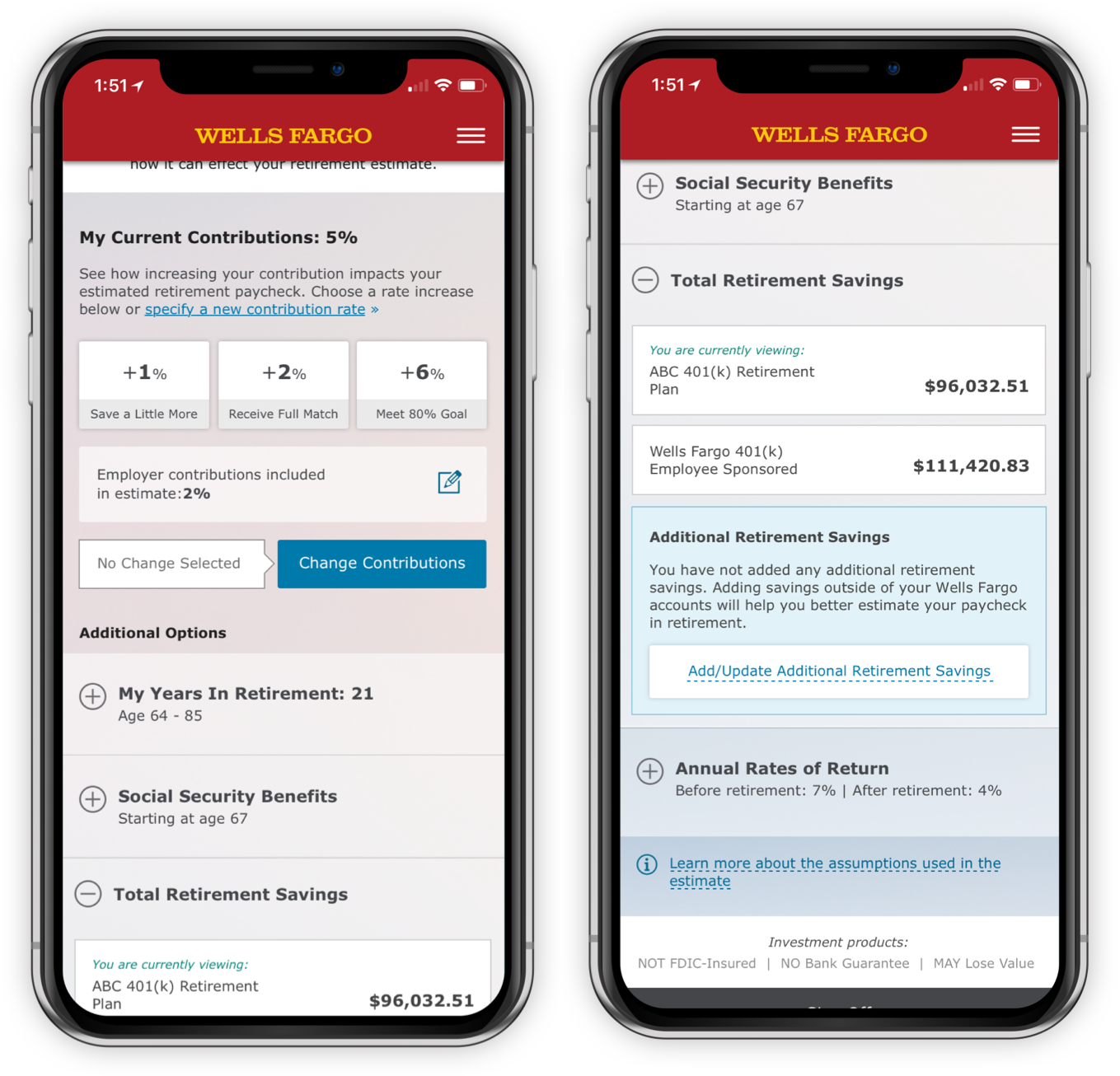
Design for Numbers
People need to see clearly what they’ve input in order to decide. Just like a traditional calculator—the tool requests the user make one input at a time in order to deliver the message but does not separate inputs that all relate.
Project & Role
Balbix,
Principal, Product Design
Principal, Product Design
Client
Balbix
Date
2020-2023
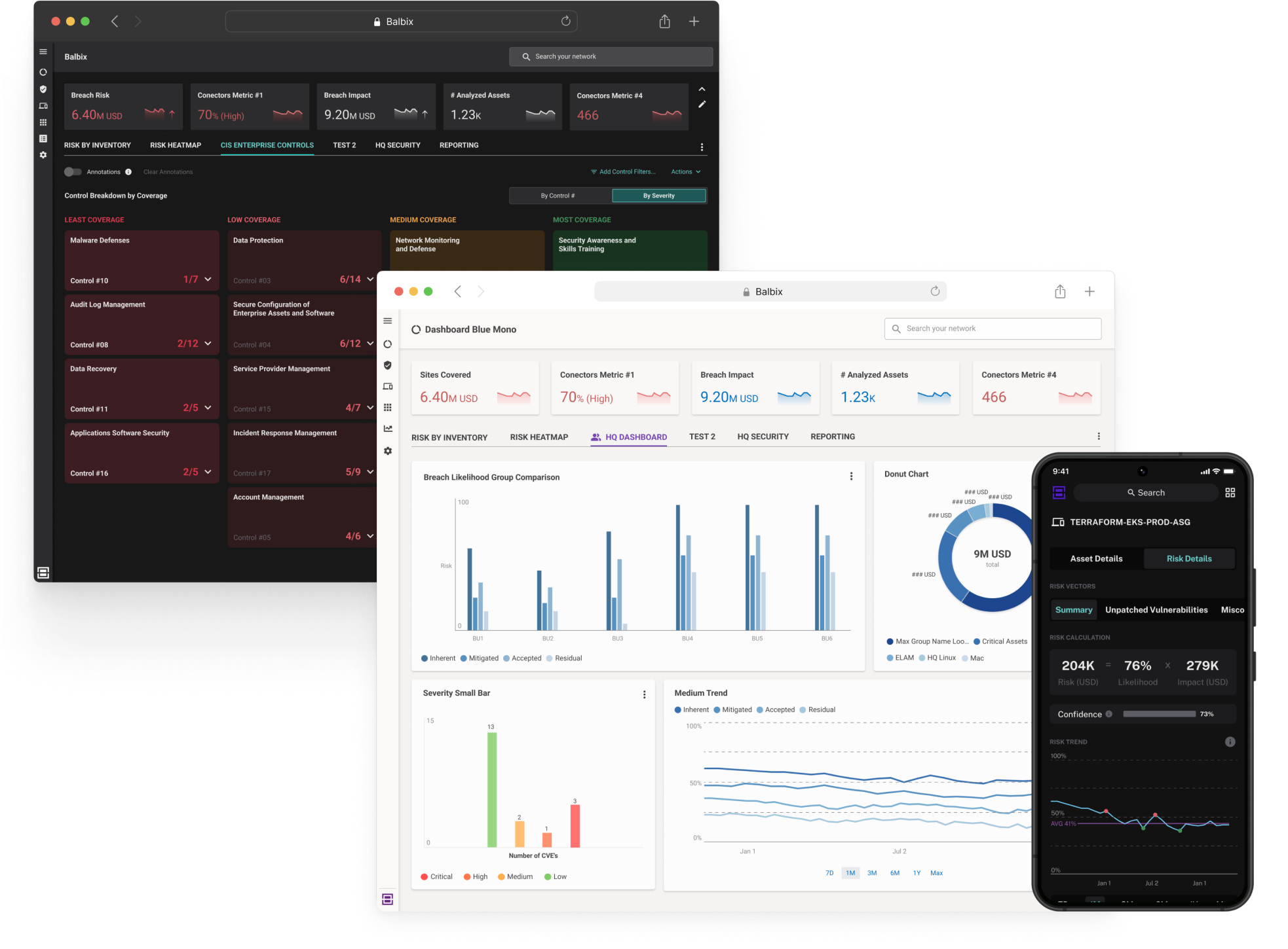
GOAL
Help IT and cybersecurity departments of all sizes manage and visualize risk across global networks of physical technology devices and digital assets, for all professional levels (CISO to associate).RESULT
Created design system aligned with existing MUI.com architecture, launched product light mode, increased product usability, and saw overall ARR of the product rise by 10’s of millions over the course of 3 years, and 168% increase in customer assets under management.MY ROLE
Principal Product Designer, Introduced company to design system standards and processes, integrated design thinking (as much as possible) over time while handling complex data asks from customers. Lead engineering and design teams in UX standards for library components.Due this work being under NDA, I am limited in showing it online. I would be excited to show more of what I accomplished at Balbix during an interview.
Project & Role
Bank Account Servicing,
Lead Visual Designer
Lead Visual Designer
Client
Wells Fargo
Date
Q2 2017
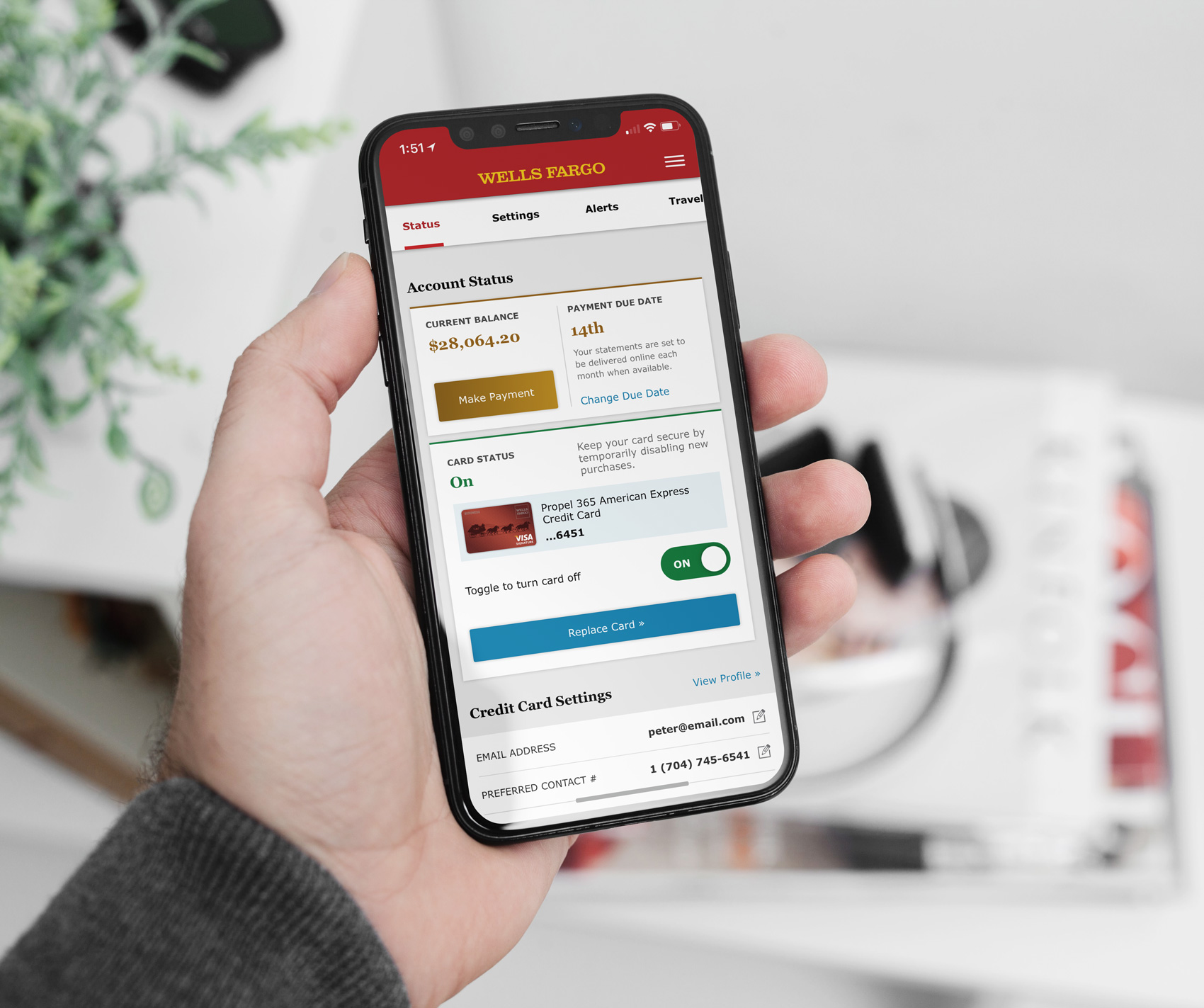
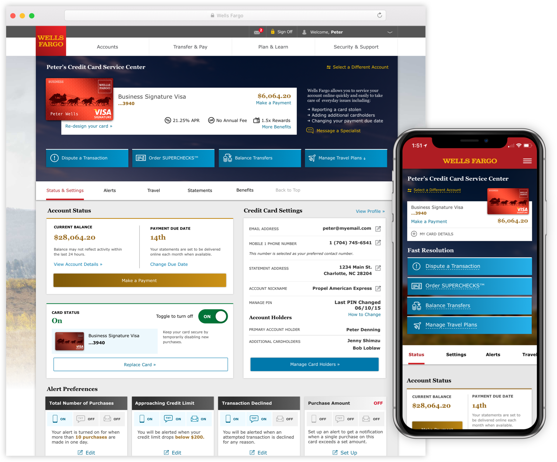
GOAL
Define what online credit/debit card servicing should look like for Wells Fargo customers, in order to reduce phone and in-person customer support instances.RESULT
A single web page, that included all major account servicing tasks, in customer priority order.MY ROLE
Lead visual designer, responsible for helping craft the UX through UI and interaction design, assisted with research artifact creation and user testing.
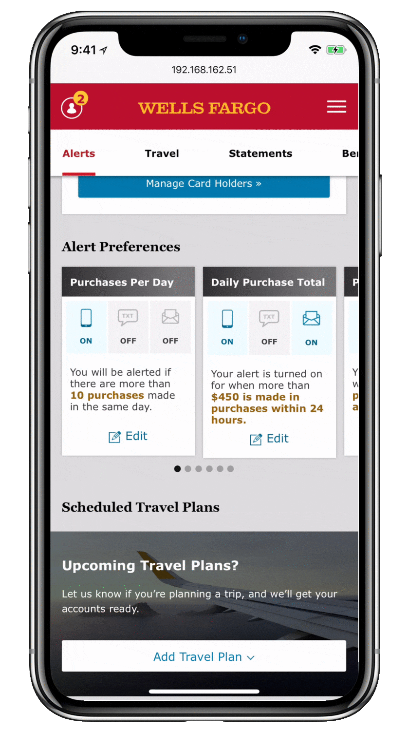
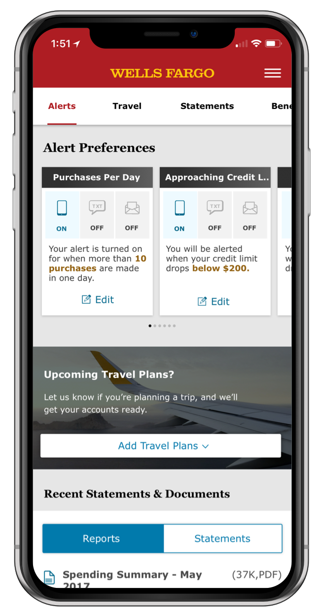
Reducing Calls to Customer Service
WHO
All banking customers, applicable to credit cards, debit cards, home and auto loans.WHY
Findability of basic account services within Wells Fargo ecosystem was failing customers, and they were spending too much time calling support, or going to the bank.
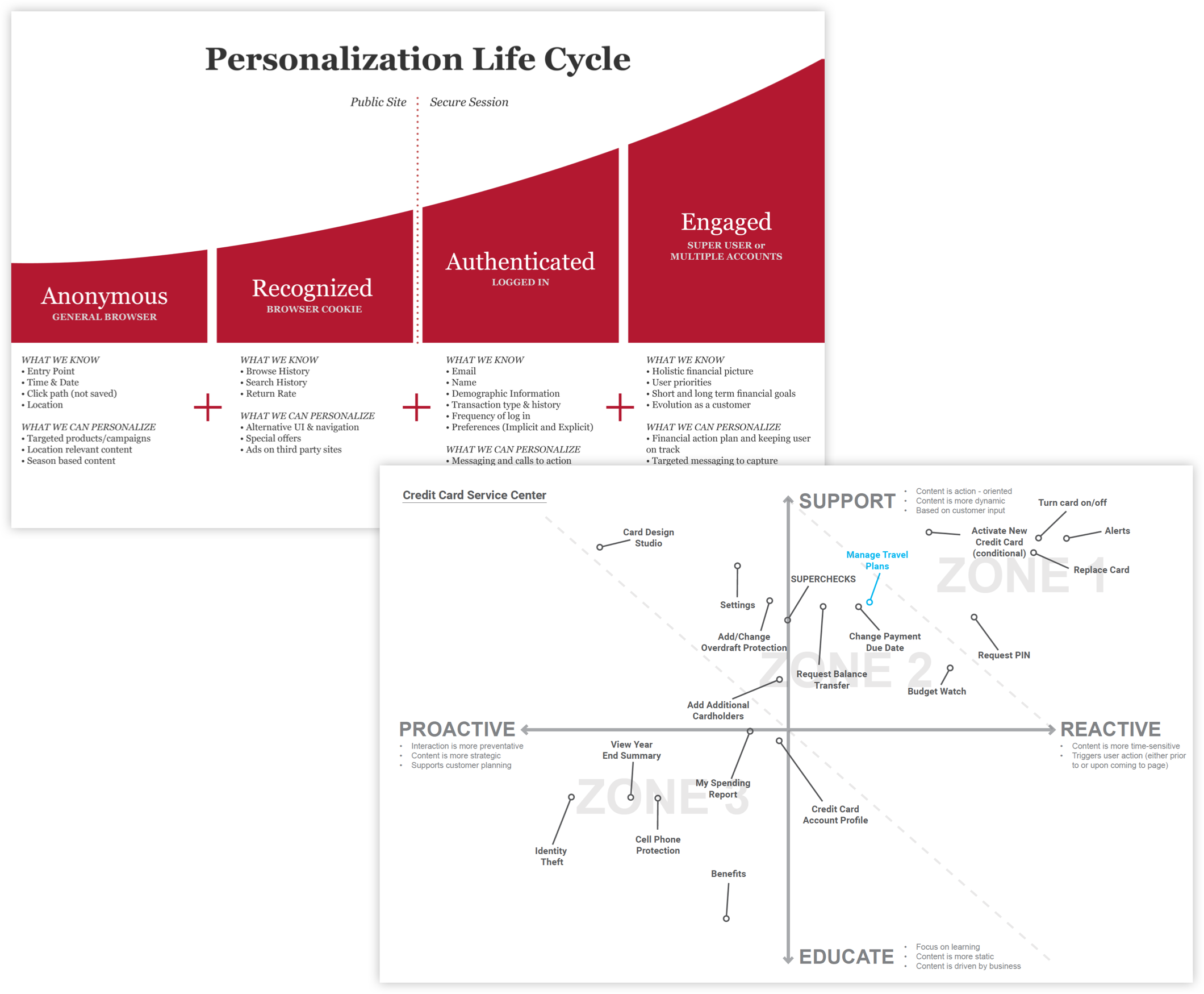
Research Artifacts
Artifacts like these were created from discovery of customer needs and informed the entire design process. We changed and improved our clients existing thoughts on the servicing experience, through design and user testing results.
WE LEARNED
Customers need these tasks readily available, as they’re accessed most frequently during times of an increased emotional response towards the task.
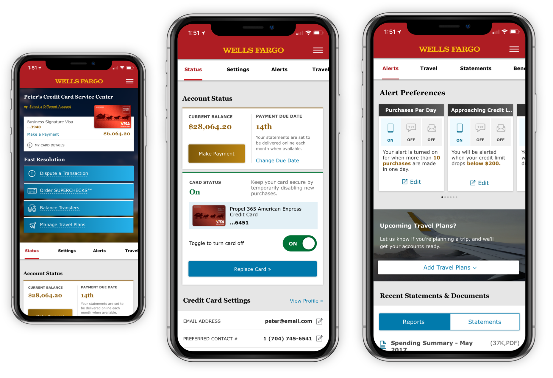
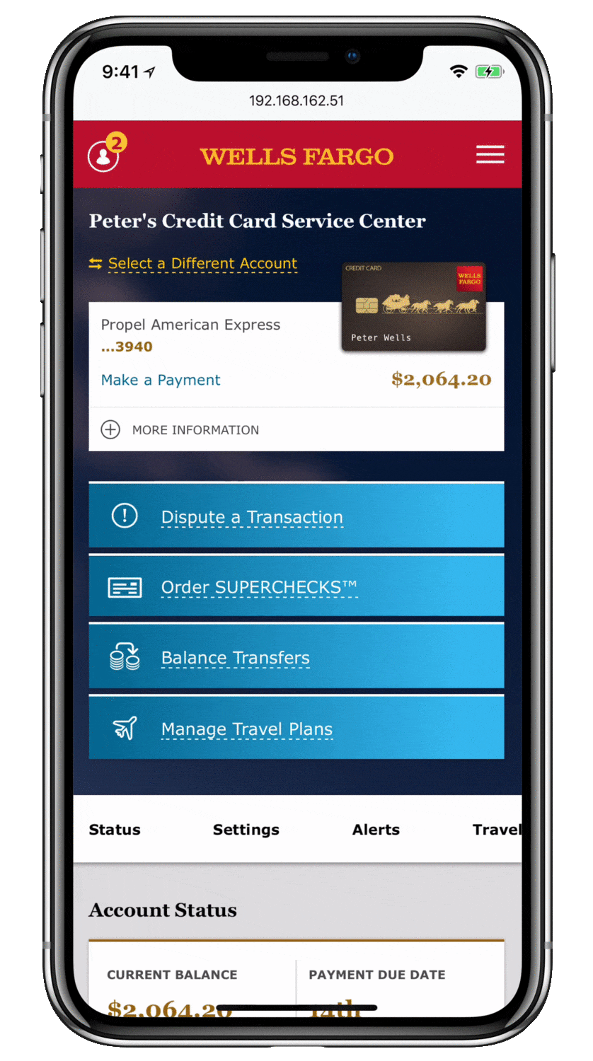
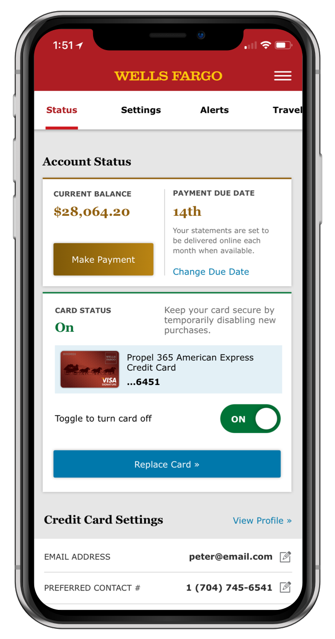
A Composed Mobile Experience
During user testing, we watched as this design empowered customers to feel they had complete control over their account at first look. Increased findability of all tasks on the page, and digestible content blocks were key.
EVOLUTION
The remaining problem we needed to solve, was how customers find this servicing page when they need it—within the product ecosystem—and if they would give up and seek other support options before realizing they had missed the service center entirely.
In Page Navigation
Wanting the user to discover and try, we included a simple animation for the horizontal scrolling navigation area. By meeting them where they are, the bar offered not only a quick way to navigate—but a better way to understand possible actions.
On Page
Task Completion
Task Completion
Completing a high emotional response task without needing to load another page is best. Users were confident in these page actions. We introduced a higher standard for page interaction amongst Wells Fargo product groups with these ideas.
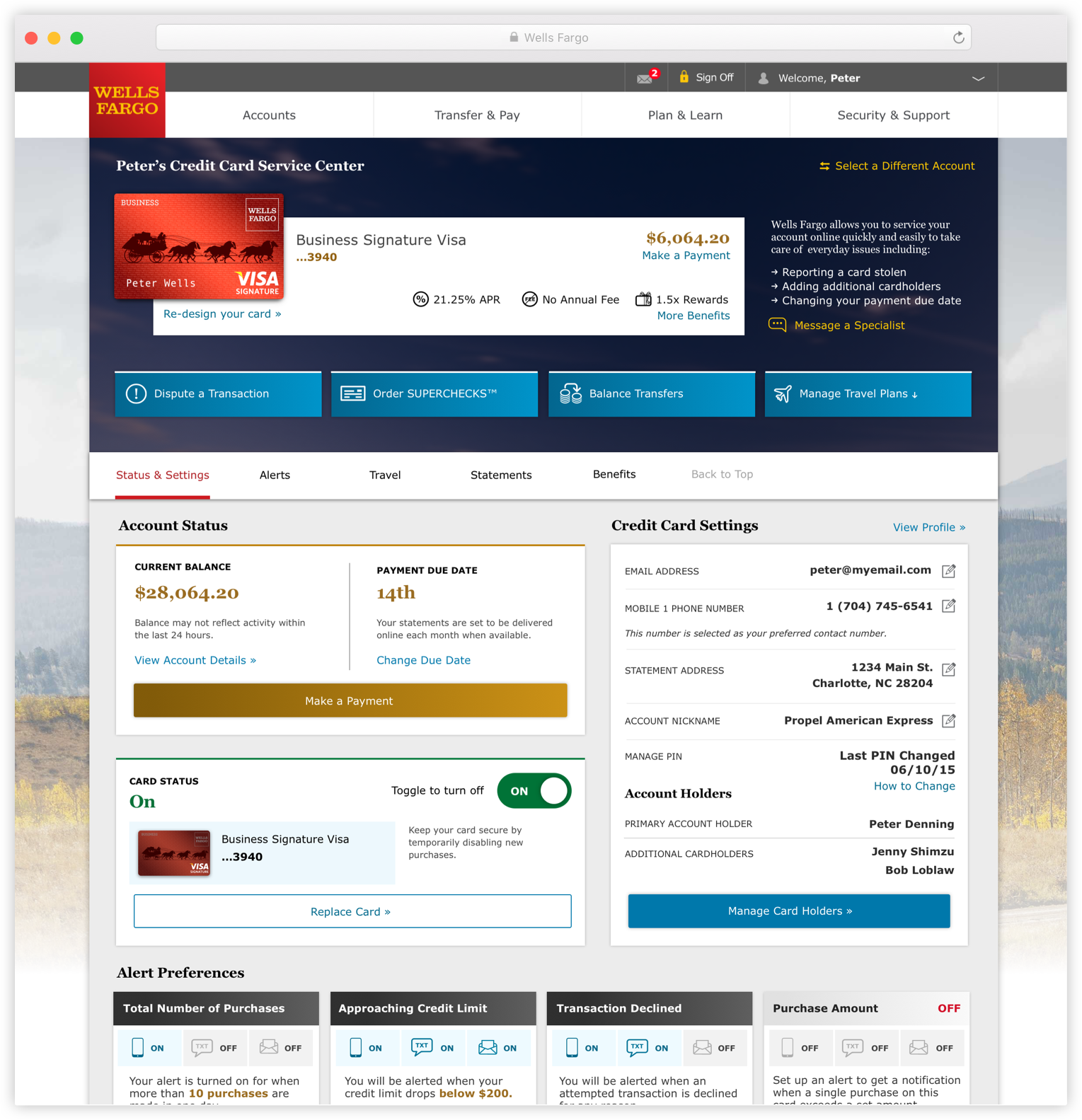
Desktop Experience
All of the product decisions for this servicing page were simultaneously prototyped on desktop.
We experienced the same great results with the desktop page. We learned that some of the darker page areas below the hero image were perceived by some users as advertisements on desktop. In version 2.0, we are adjusting the strategy and design of these sections.
We experienced the same great results with the desktop page. We learned that some of the darker page areas below the hero image were perceived by some users as advertisements on desktop. In version 2.0, we are adjusting the strategy and design of these sections.
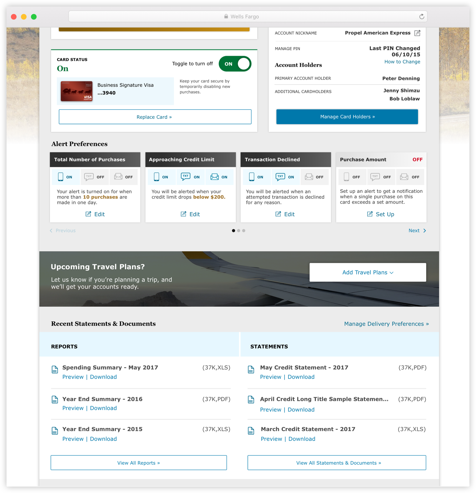
Desktop page design continued.
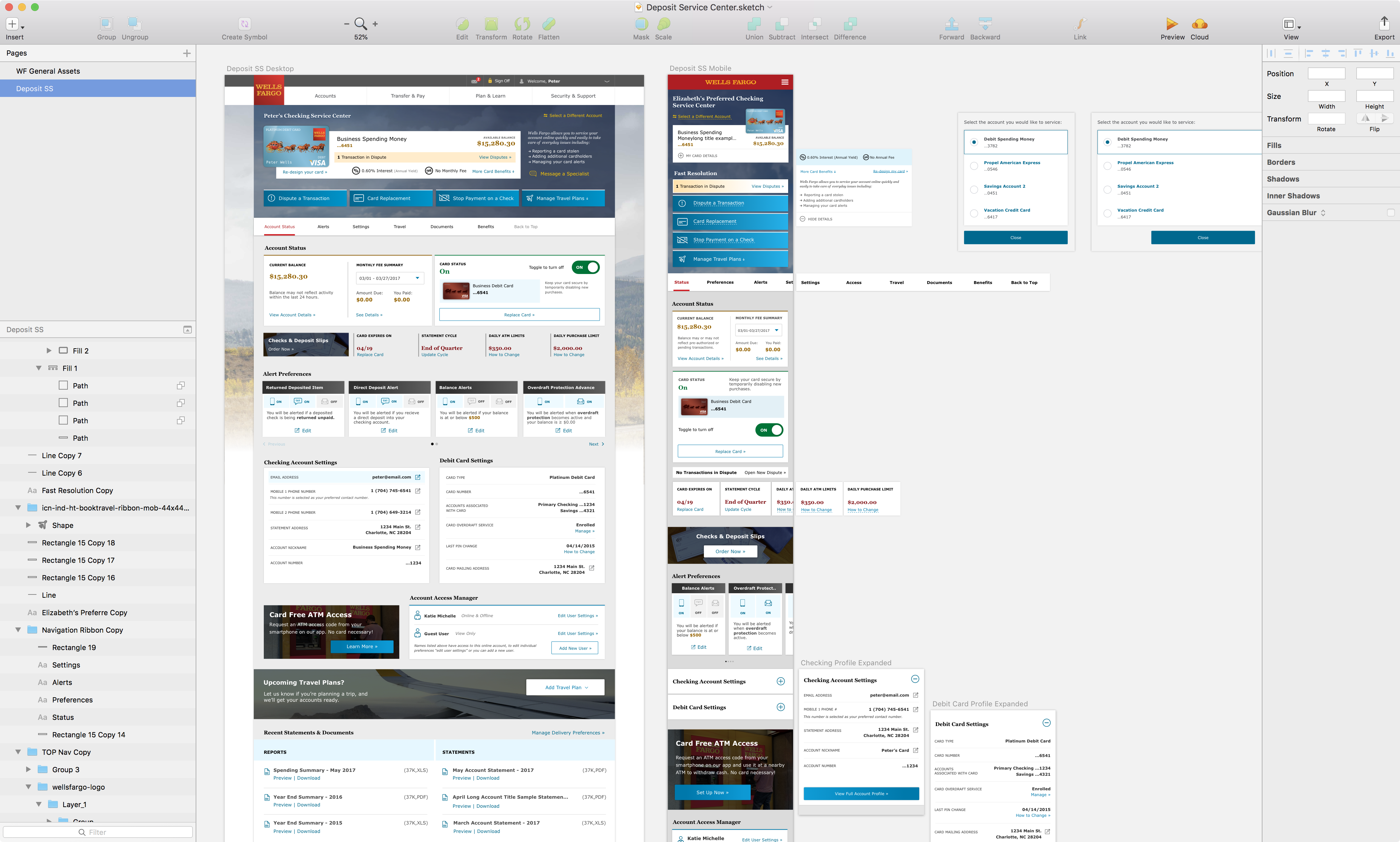
Interaction Planning
A snapshot of off screen interaction planning, and how I executed that idea visually for myself and our front end developer in Sketch. Simple yet effective.
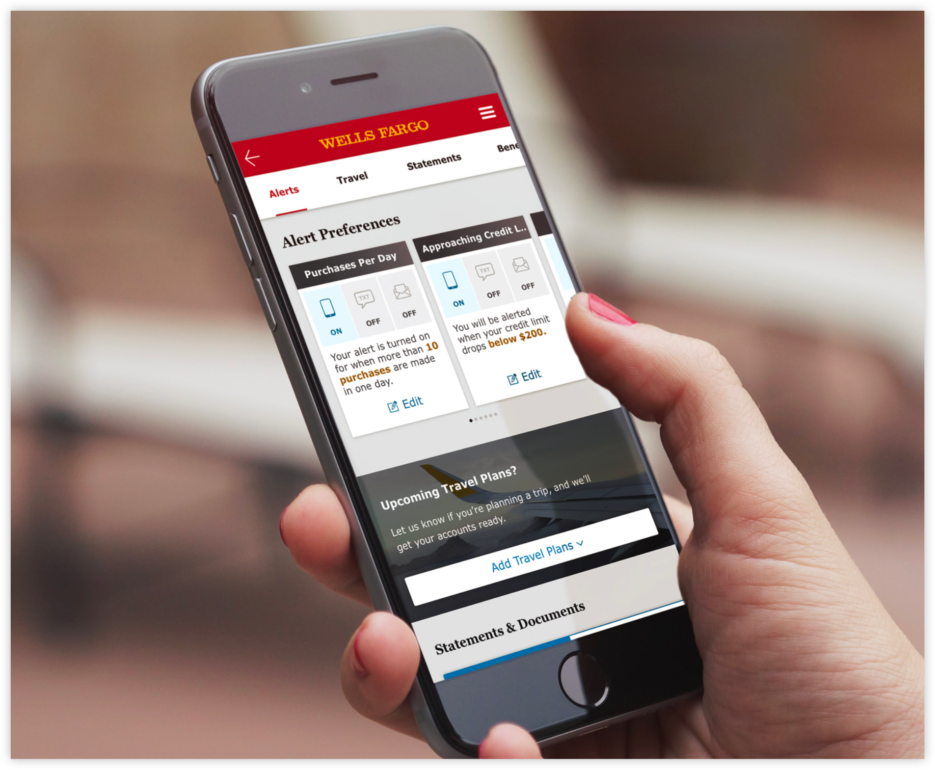
Meet Your Customer Where They Are
Leverage and extend the relationship customers have with their banking app.
Support customers in the way they need, and in the context they ask for it. We ask customers to get started on their journey to account servicing through this product.
Support customers in the way they need, and in the context they ask for it. We ask customers to get started on their journey to account servicing through this product.
IN THE END
We learned that most customers enjoyed this experience over the complexity of a phone call. Lines of business in the bank are eager and excited to extend this design to their customers.
Project & Role
Transit Mobile App,
Lead Visual Designer
Lead Visual Designer
Client
SEPTA
Date
Q3 2017
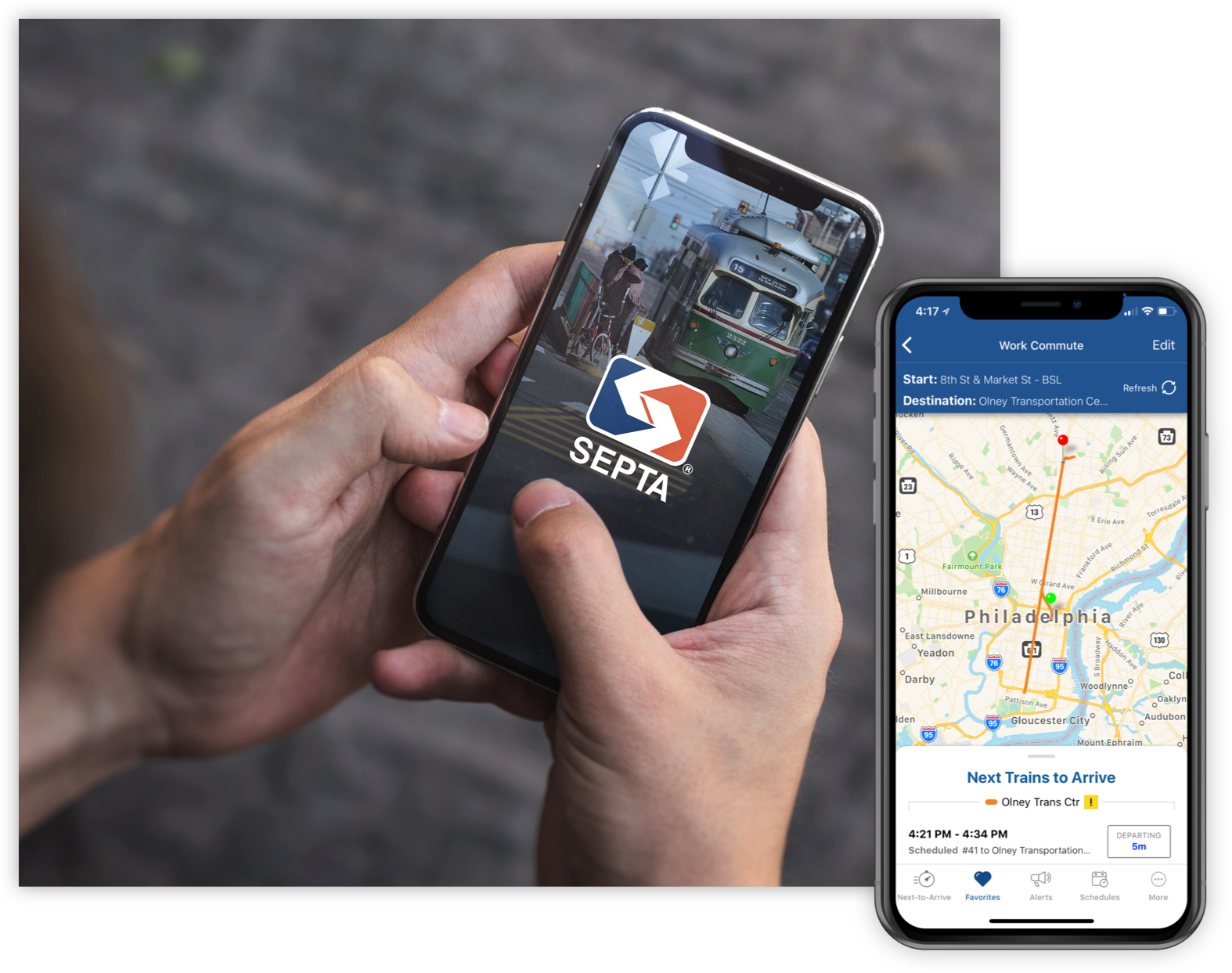
GOAL
Redesign The Southeastern Philadelphia Transit Authorities mobile application. (iOS & Android)RESULT
An interface that purposefully leveraged HIG’s from Apple & Google, to better fit the needs of their development timeline, limited resources, and existing technology stack. MY ROLE
Created the visual and interaction design of the application as well as version 1.0 of their brand standards for mobile devices.
App Design
WHO
Anyone in the Philadelphia area using SEPTA transit vehicles, with a focus on better serving residents and frequent travelers. WHY
Their existing application was extremely out of date, void of a user experience that promoted everyday use. Developing both platforms at the same time was an ideal process for this re-design. Small differences such as hard edges versus rounded corners, were important for each instance of the application to feel more distinct and native to each platform.
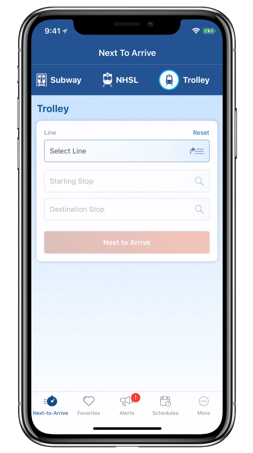
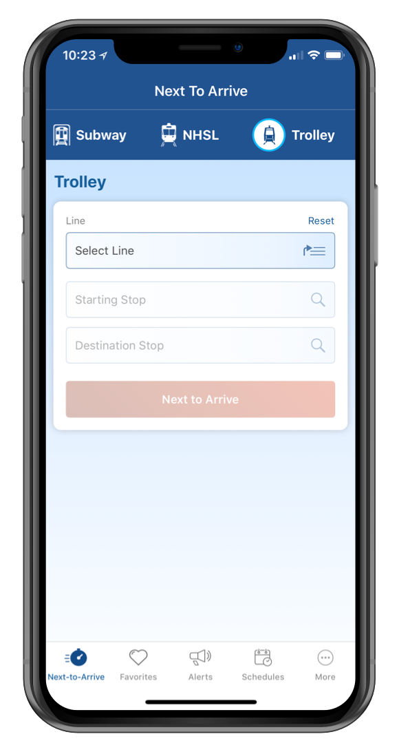
Next-to-Arrive
GOAL
Remove unnecessary line and schedule information from the view, until the user has confirmed which route they need to take. RESULT
The Next to Arrive section, which allowed riders to select only the line and stops they needed to see and acted much more like a trip planner than the previous design.WE LEARNED
This section isn’t very helpful for commuters who aren’t familiar with station & train names (~15%). This resulted in bringing back a traditional map view to this section, in version 2.0.
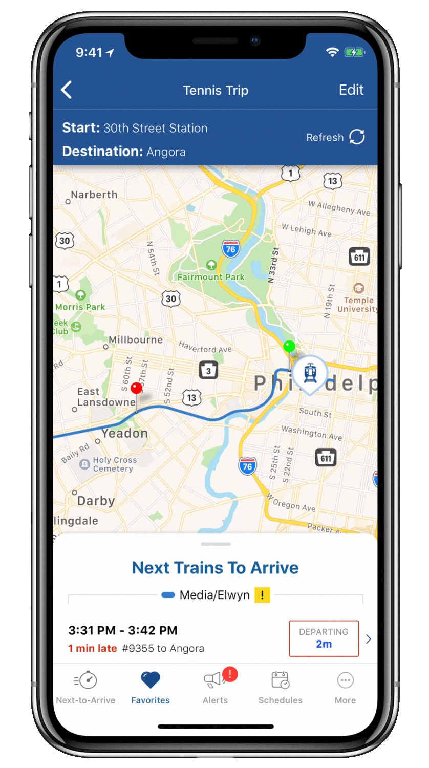

Time Details & Transit Vehicles
REQUIREMENT
Transit commuters requested time and vehicle data be presented in a more digestible format. This was also mixed with the desire to not remove map view entirely from the page, as they felt better oriented from it.RESULT
The Next to Arrive Card delivered information to the customer, with included map view. The 7/8th’s sheet was a quick way to give more priority to the time table, further meeting their needs and increasing frequent use of the product.
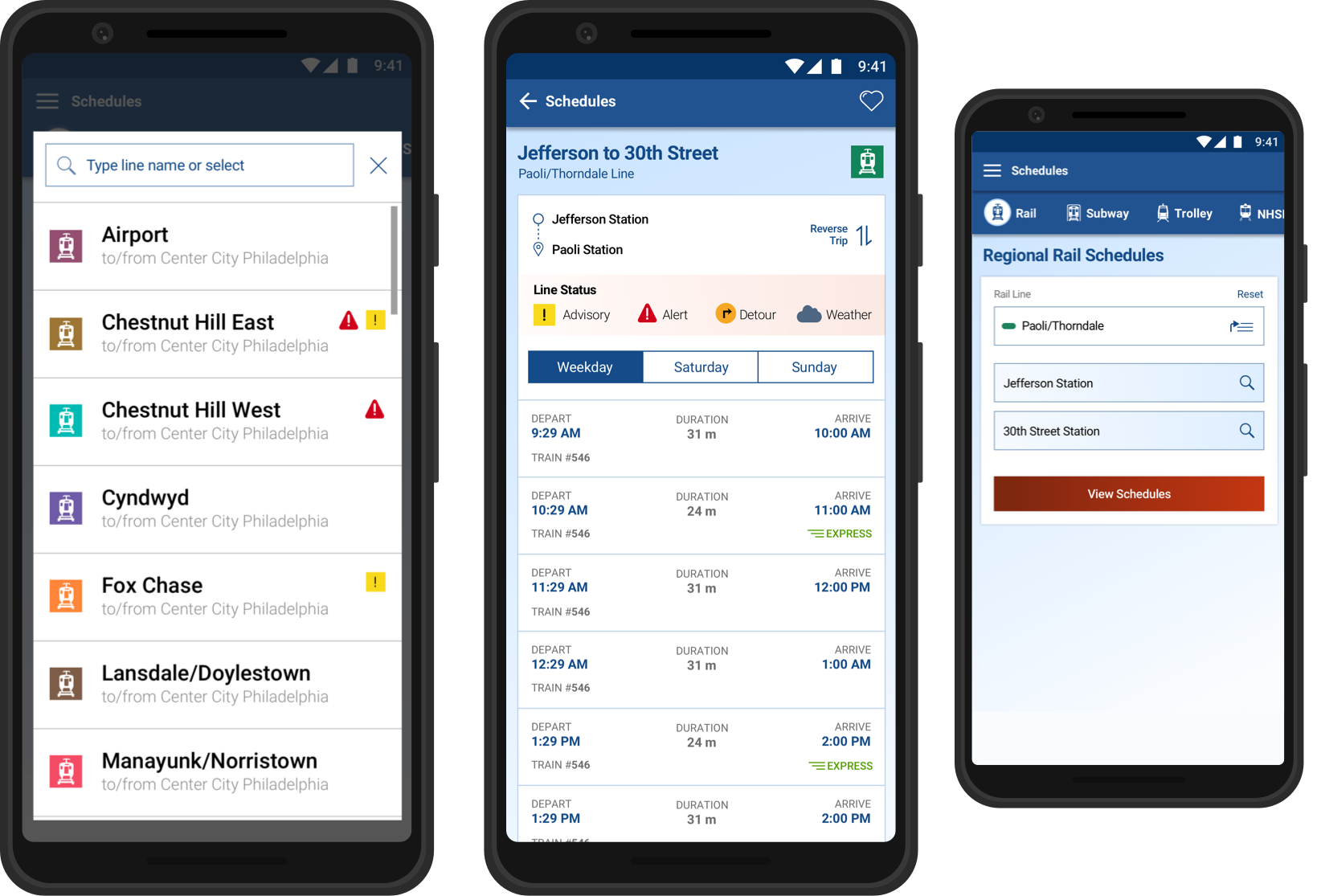
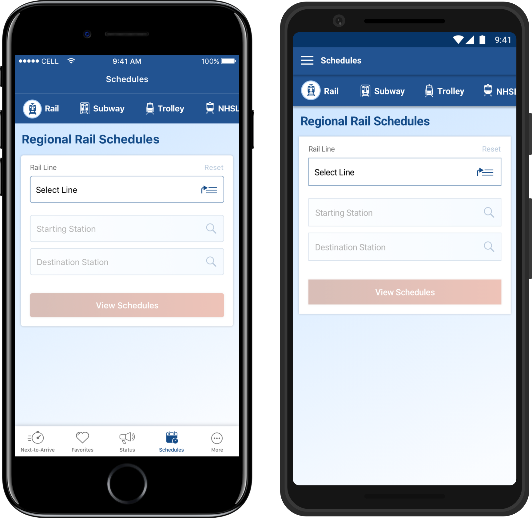
Schedules
Choosing a route was the same experience from Next-to-Arrive to Schedules. The two menu items also linked between each other, which kept the user’s previous selection.
WE LEARNED
Customers as a whole are using next-to-arrive about as frequently as they are using the schedules section, and both more frequently than favorites. This has us re-thinking certain UX approaches for version 2.0, to better meet the customer where they are.
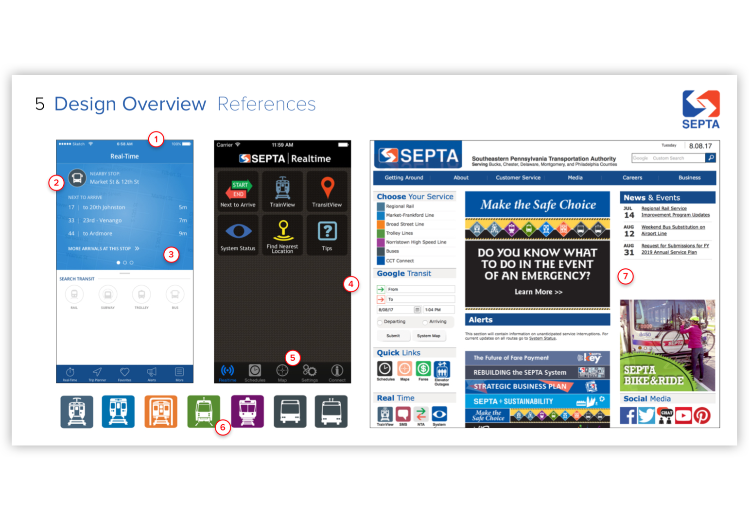
Materials of Influence
MANAGE
Minimizing visual strain of the existing digital brand was our first goal. Our team needed to manage necessary visual data through changing SEPTA’s standard of visual information display.
UPGRADE
The published design revolved around the idea of simplifying their color palette and utilizing color only to indicate a physical transit line or vehicle.
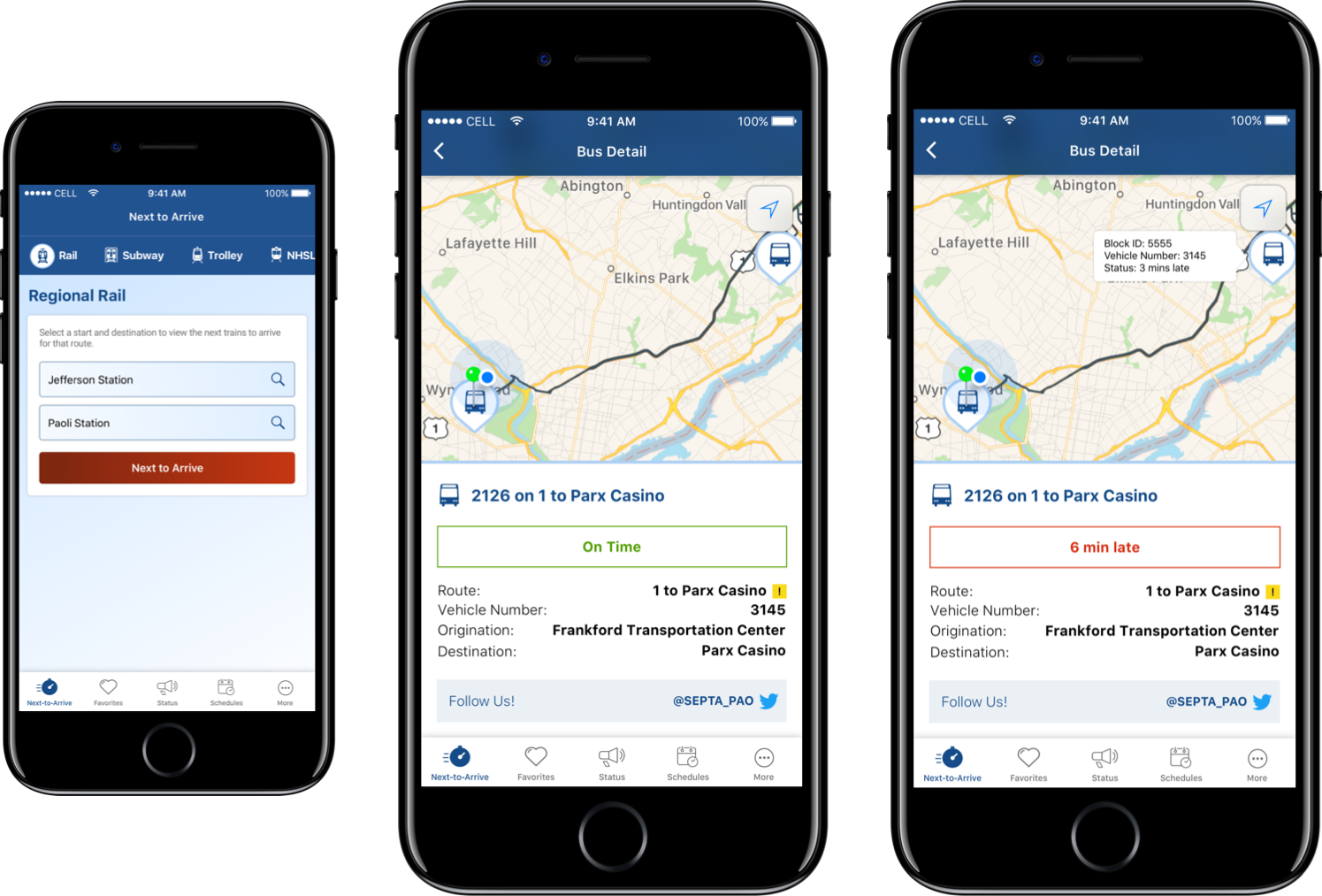
Real Time
Vehicle Data
Vehicle Data
WHY
SEPTA is subject to every weather pattern throughout the year, and real time data allows commuters to feel in control.WE LEARNED
By providing the most detail SEPTA could offer on each transit vehicle, the product environment became more forgiving and less frustrating for commuters.
Symbol Library
Translating artwork from SEPTA’s physical signage was key for an expert understanding of our UI. Managing and upgrading these assets were all part of our consultation process of the product design.


Favorite Trips
WHY
Commuters frequenting the same trips asked for ways to save trips, an obvious enhancement request.WE LEARNED
The implication of this feature is probably too subtle for people who don’t realize its purpose—and mimics the visual language of social media likes a little too much—when the functionality offers much more to the user.
Project & Role
iPad Kiosk Survey,
Lead Product Designer
Lead Product Designer
Client
Hilton
Date
Q4 2017
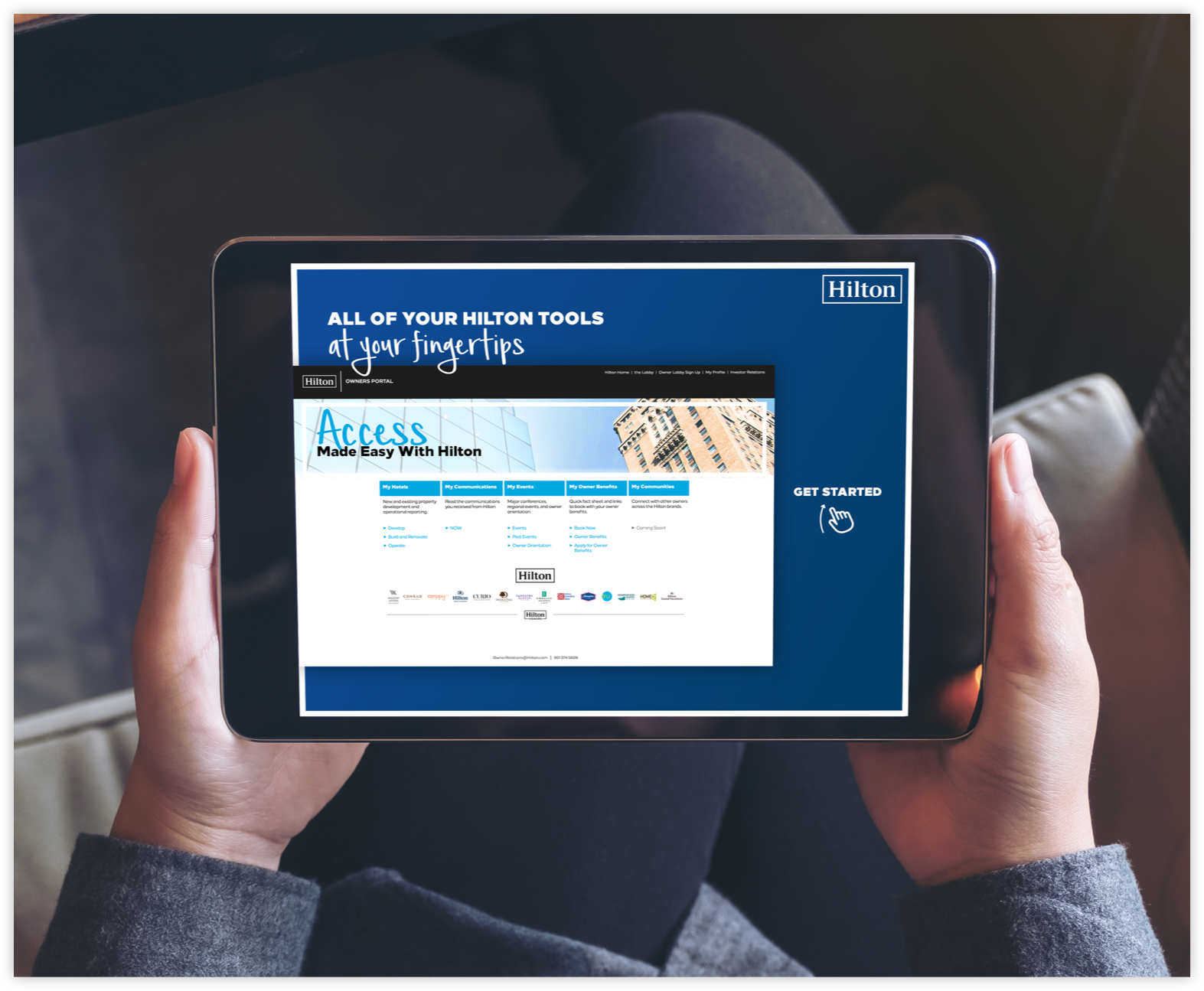
GOAL
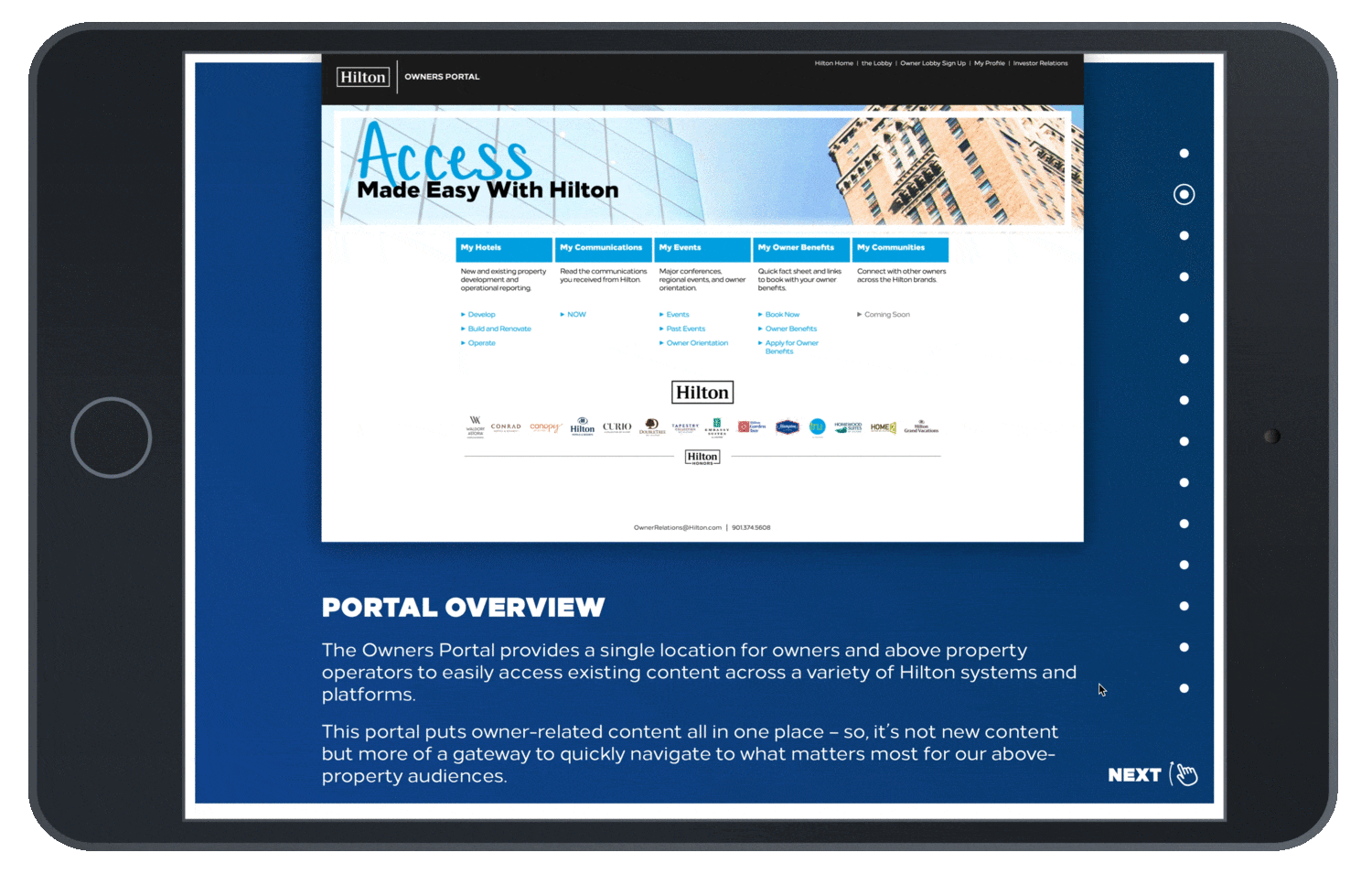
Create a questionnaire and web portal walk-through for iPad Kiosks at Hiltons Global Property Owners conference.
RESULT
A virtual tour of Hilton property owners web portal—with quick questions sprinkled throughout the experience.
MY ROLE
Lead Product Designer working alongside a front-end developer to create kiosk experience. Responsible for all ux, visual, and interactive decision making.
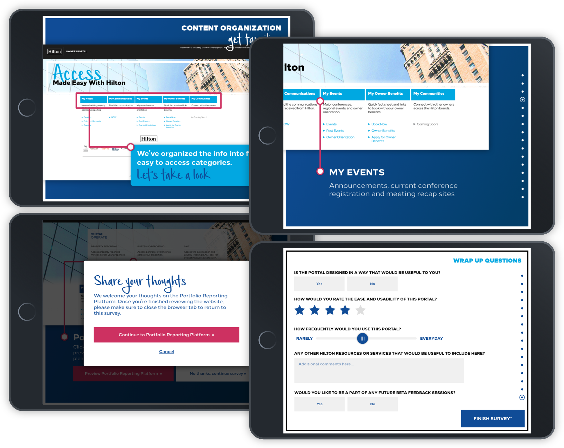
Gather Understanding
& Answer Questions
& Answer Questions
WHO
Property Owners for Hilton utilize this portal for important needs, like property renovation loans and ownership data—so it was important to understand their feedback on the proposed design and information buckets.WHY
Without property owners, no global hospitality brand would have a meaningful impact. The leaders of lodging real-estate are the key to a successful relationship between the brand and the services it offers to the public.

A Hub for Owners
DISCOVER
The design of this kiosk was a central point for the lobby-networking space of the conference. Making sure the design of the survey was inviting and attractive was Hilton's product goal.
LEVERAGE
Making property owners feel heard through the kiosk and portal design was important. Leveraging their support an amplifying their voice is a tangible way to improve brand footprint.
IMPROVE
Taking ideas for a test run in a real-world setting is the best way to improve any digital product. This conference offered the best time to perform these test runs, and gather feedback digitally and in person.
Simple Animation
GOAL
The less static the survey and questions felt, the more responsive property owners would be.RESULT
Fluid page-walk-through animations that grounded the owner in the content and meaning.
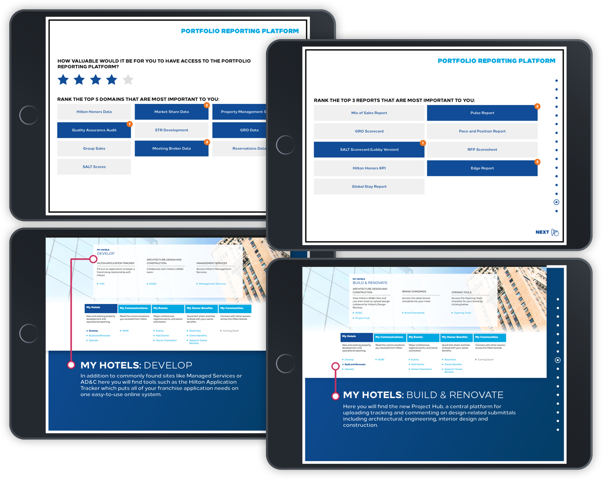
Amplify Value
GOAL
Better understand the web habits of Hilton property owners (and their respective teams).RESULT
Simple tap or type questions that kept the owner moving through the information quickly.

Think, Feel, Do
Ultimately, we asked owners take an active part in the brand building process, through a better understanding of their needs. The kiosk questionnaire was the central pillar of this proces.